What is the Community?
There are over 1 billion websites on the internet, and far fewer System Administrators who configure servers for sites that have complex and varying needs. The DigitalOcean community platform aims to make SysAdmin's lives easier as they begin or continue their journey toward learning system administration skills.
When I started working on the Community, it existed in a rudimentary state — a blog with hundreds of tutorials complimented by a fairly traditional forum. Content was indexed extremely well by Google due to quality, timliness, and the technical accuracy of the tutorials. For instance, if I were to search a very common beginner SysAdmin subject in Google set up password authentication apache, a DigitalOcean tutorial would be in the top three results. This created a reliable influx of traffic to the tune of about 5 million unique visits per month, representing about 90% of all community traffic! The community was less of a destination, and more of a collection of amazing tutorials that Google deemed a top resource.
The challenge became clear: We must continue writing quality content and shift our product into a destination for developers so that they might help and learn from one another. We must build, a community.
we must...shift our product into a destination for developers so that they might help and learn from one another.
By leveraging the community's existing content and readership, we were able to create more than just a resource for SysAdmins, but a rich platform for them to learn and better themselves in their field.
The New Community
Community 2.0 is a brand new app, rebuilt to meet our goals. Big thanks to Alex Penny for his design contributions! The content is comprised of three main sections:
- Tutorials
1300+ tutorials written with love by DigitalOcean writers. - Q&A
Community-generated questions and answers on SysAdmin subjects. - Projects
Apps, Wrappers, and other integrations built on top of the DigitalOcean API.
The app's IA is built around these three core buckets of content, as well as the user and tag objects.
Browsing the Plethora of Content
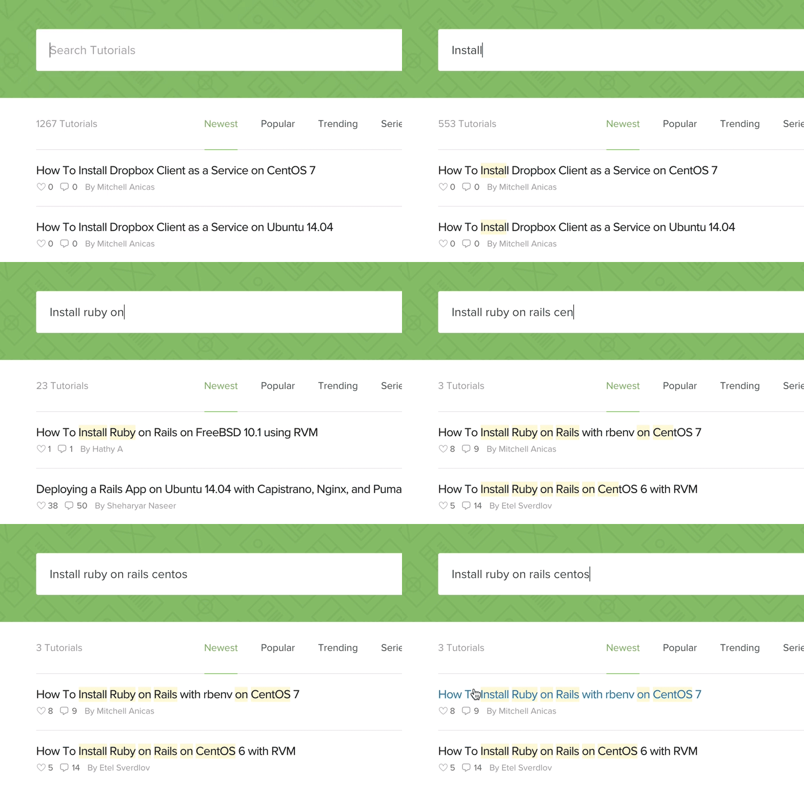
Building towards the goal of a creating more of a destination, the thousands of resources the community provides must be easily accessible. So when we have sa plethora of content covering vastly different subjects, what is the best way to locate this content? First, we must understand the user. The majority of users who arrive at the community already have a particular topic in mind. They aren't intereted in exploring a wide array of subjects, but rather in one particular area of focus. Based on this assumption, we wanted to build a powerful search tool that delivers instant and relevant results from the first keystroke.
Using Algolia, we built a super powerful search tool and tested a few different combinations of filtering options, algorithm changes, and metadata integrations. There was some interesting learning, particulary related to tags.
As tags play a vital role in classifying resources, we tested their usefulness as a part of the search UI. We found that users were not utilizing tags within the search tool and prefered to search using free-form writing. While tags are still a very important part of the search algorithm and tutorial metadata, users prefer to surface content via search bar versus traversing a heierchy tree of many tags. If users search nginx on centos 7, it immediately returns the exact content they need. If a user is looking for the newest or trending content, filtering options are available.
Consuming Tutorial Content
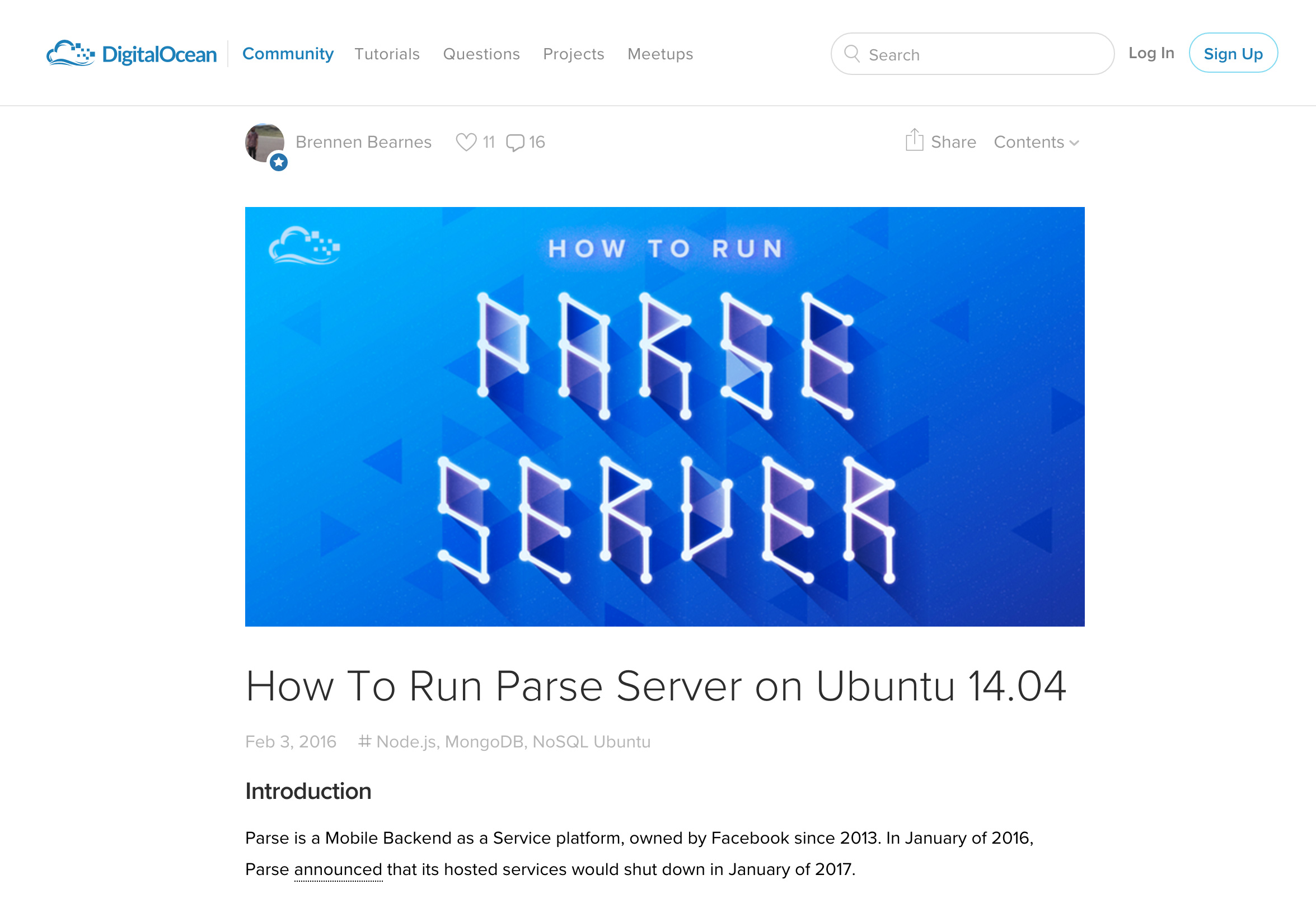
The core of the DigitalOcean Community lies with tutorial content and the reading experience. As the majority of content-consumers come from Google search results, the reading experience must be optimized for quick and easy consumption. Users are presented with a distraction free, easy to follow tutorial with tools such as tables of contents and multi-lingual translations.
The tutorial UI is optimized for reading and building. Because the nature of the content is so technical, common behavior is for readers to toggle back and forth between the tutorial and a programming environment. As a result, much focus needed to be placed on the display of code. Code examples needed to be informative in how they were displayed, therefore editorial control had to be extremely flexible (more on that later).
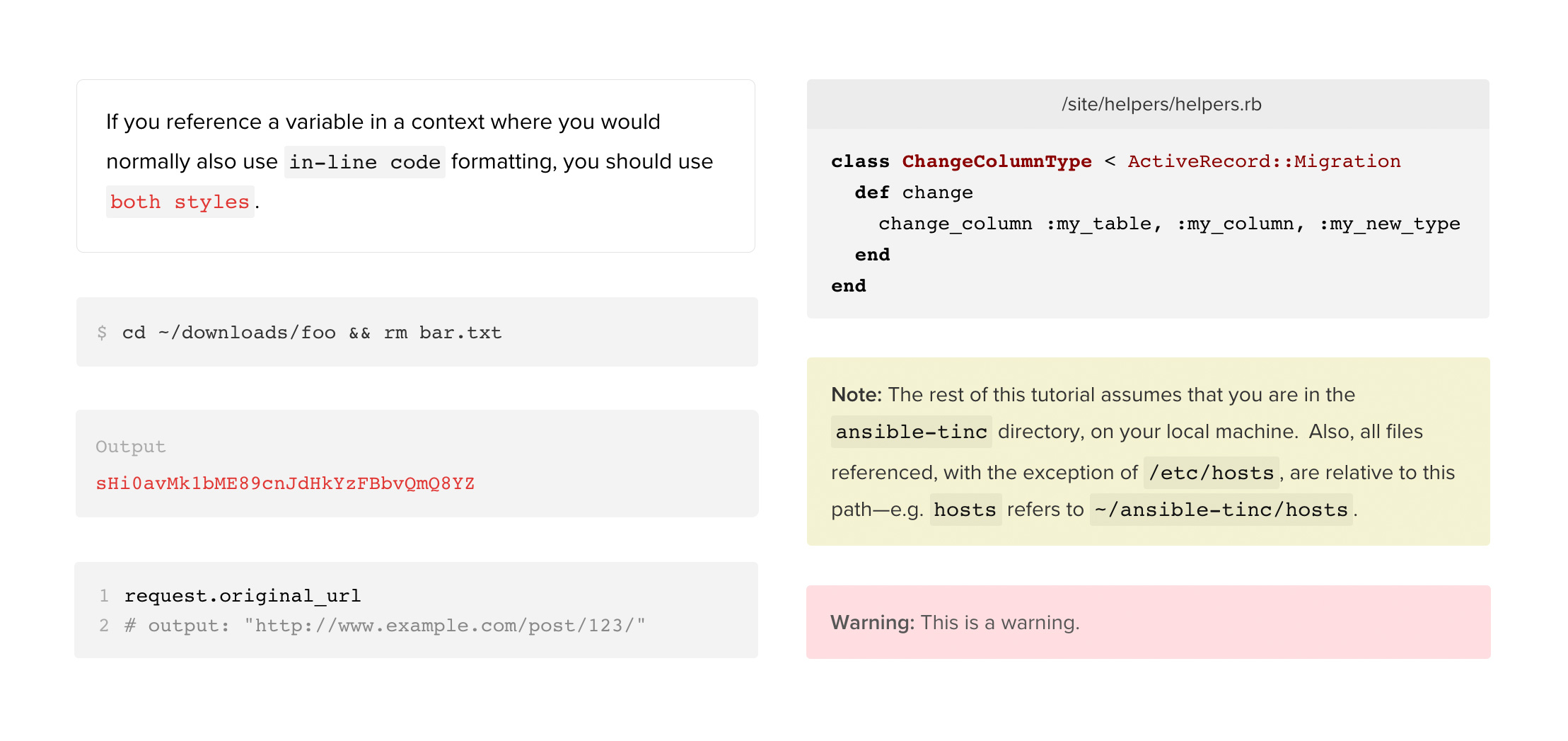 An array of different code block types
Show some love - the 'Heart'
Throughout the community lives a very special icon - the heart. The heart action is used to show appreciation to other community users for their contributions. While hearts do not have a 1:1 correlation with popularity or caliber, they are a fairly accurate indicator of quality content.
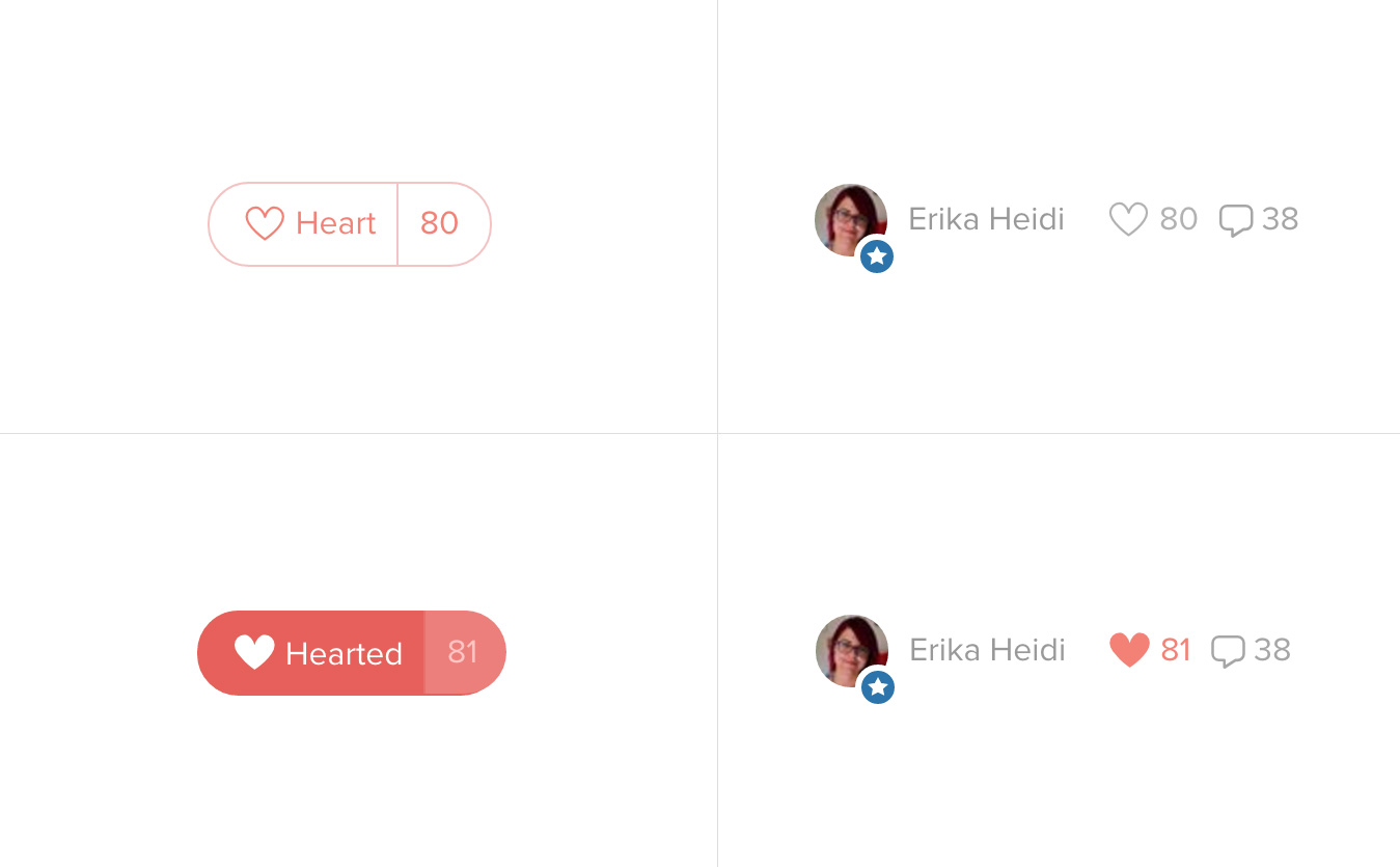 Before and after states of hearts, header and footer
Commenting
Unlike the DigitalOcean blog, which uses the Disqus Commenting Platform, we wanted to roll out our own commenting system that provided a much richer suite of functionality. Since commenting is the core form of user interaction within the community, we wanted to adopt UX patterns that were fairly known as a foundation, and extend it with useful features for the technical publisher.
We required unlimited threading for conversations at any thread depth, the presence of social profiles accessible through user avatars, very concise actions (heart, reply, report), and a clear design. There had to be enough whitespace to meet the DO aesthetic, but not so much that it rendered a 100+ comment thread unreadable. Comments also needed to be optimized for code display, so rich Wysiwyg editorial control was essential.
The real magic lies in the Wysiwyg. A well-made rich text editor (also known as Wysiwyg) is absolutely critical in effective content publishing. After reviewing all of the open source tools out there, we decided to roll out our own, in what I condiser to be the single most useful component in the app.
We were not creating a tool for publishers but rather, for developers. It needed to display code just as well as long-form content, and had to meet the following requirements:
- Fully supports markdown as well as custom markdown commands
- Offers rich fomatting for non-code content
- Features syntax highlighting, with custom language support
- Offers instant previewing on the client side
Q&A Platform
As a front-end dev and designer, I am often developing my own work. When I am stuck on a JavaScript problem, I might use Stack Overflow in hopes that more knowledgable devs can assist. It is an invaluable Q&A app because of it's engaged community of developers.
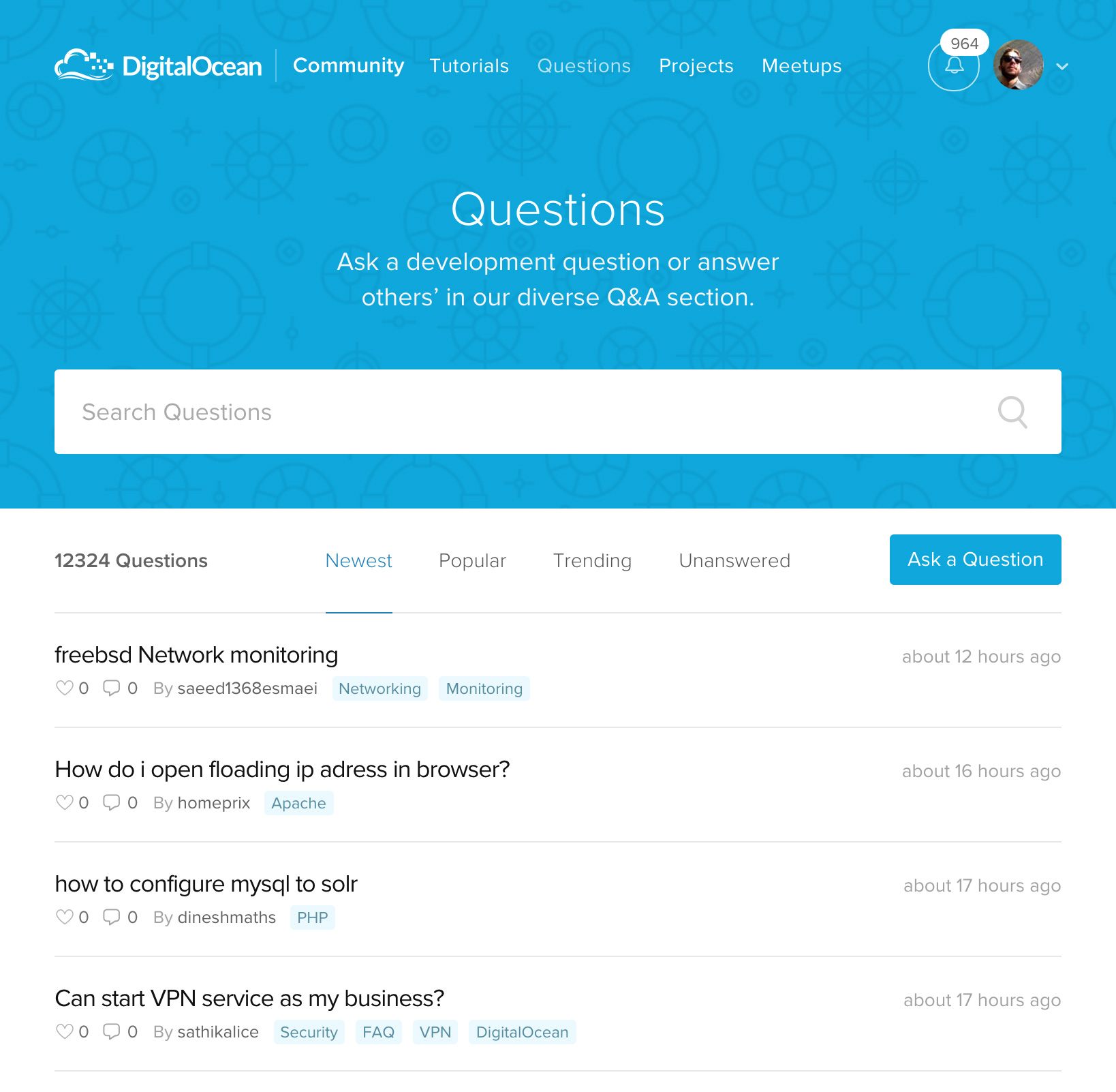
While the DigitalOcean community offers curated tutorial content, we wanted to build a feature that allowed users to ask free-form questions to the rest of the community, similar to that of Stack Overflow (or specifically, ServerVault). Since the release of this feature, over 12,000 questions have been asked; the vast majority have been answered.
Ask a question
As a user, you may have read a tutorial and are left with certain questions, or you may have a question related to system administration. The ask a question flow is extremely simple - a user types in their question using the same Wysiwyg that powers comments, with more advanced controls like h1-h3 headers. After submission, it is run through our spam filter to protect against bots. If it passes, it publishes immediately for community engagement.
The Question
Questions are formatted with the question on top and a series of answers below. There are three objects that form a Q&A discussion - the question, the answer(s), and comment(s). A user can comment on a question or an answer, or they can simply provide a direct answer to the question. This is similar to that of Stack Overflow, but unlike Stack Overflow, the initiator of the question is not able to mark a single answer as 'correct'.
Our belief is simple: There are often multiple correct answers, each with vastly different solutions. Instead of allowing only one 'correct' answer, we want to allow the entire community to 'heart' answers in order to form an appreciation-based ordering of solutions.
Projects
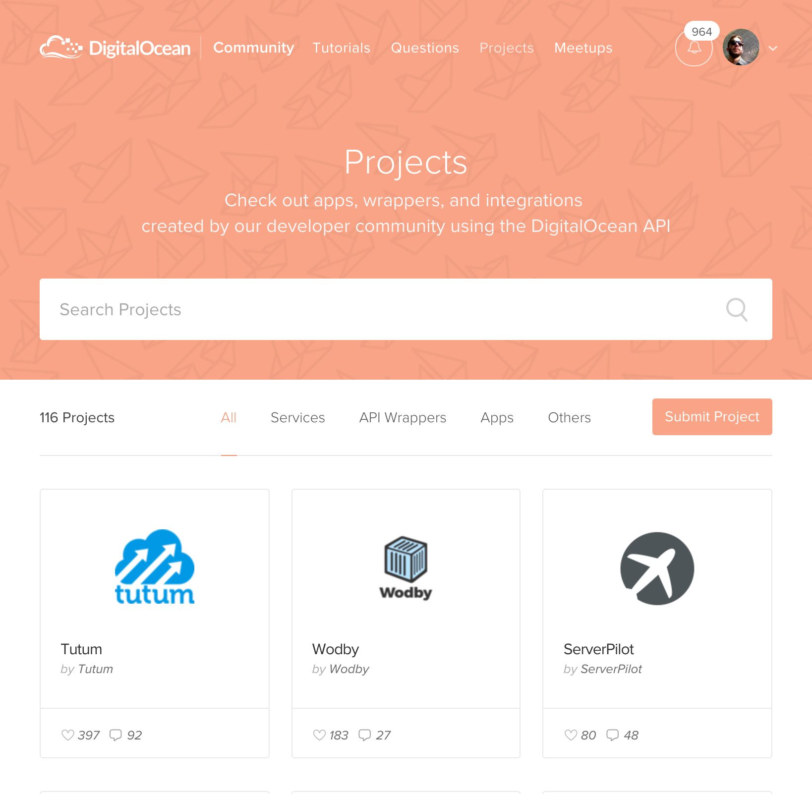
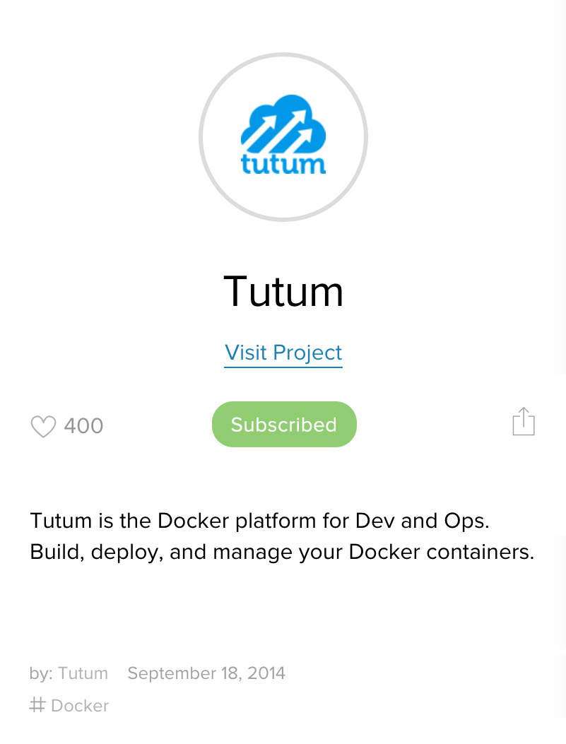
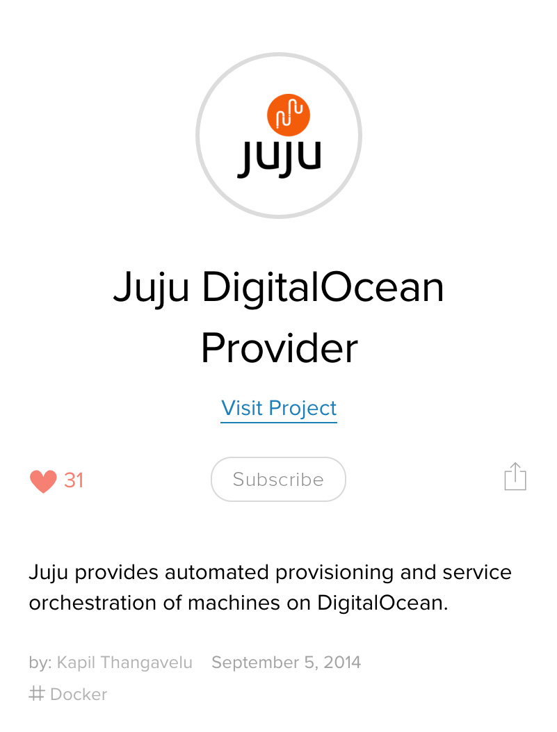
Tutorials, questions and answers all provide knowledge and the inspiration to build. The projects section showcases tools that users have built on top of the DigitalOcean API. Split between services, API wrappers, apps, and other integrations, all of the projects reflect the strength of the community. Our users are learning from the informative content and building rich integrations.
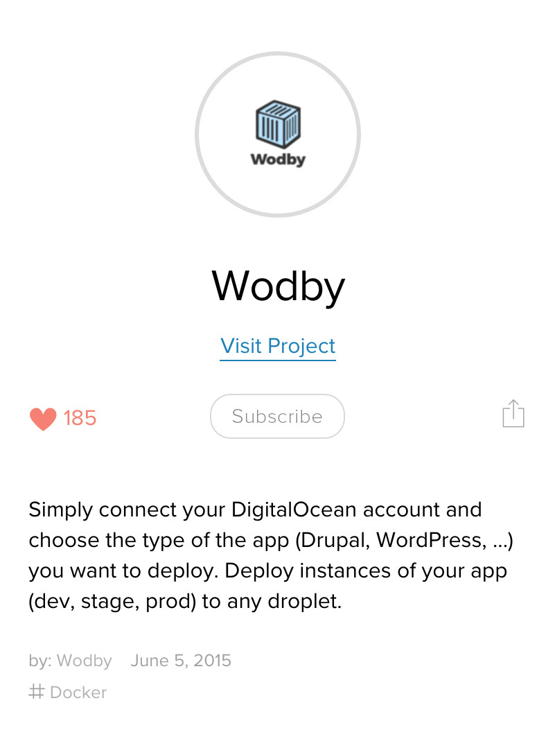
On the projects page, users can learn more about the project and hold a discussion with one another about project usage or ask technical questions.
Mobile views of project pages
User Management
So what does it mean to be a registered user of the community? A registered user not only allows you to interact with and create content, but also enables you to manage your content, profile, and preferences. You can subscribe to topics of interest and control your flow of notifications.
Profile
A profile contains information and content relating to the user. Profiles are public, and serve as a user's social identity within the community. If I were to visit a user's profile, I could learn about their interests, view external social accounts or projects, and see their contributions to the DigitalOcean Community. As the owner of a profile, I can use it to manage my questions, answers, comments, projects, etc.
Notifications & Subscriptions
As a user, I want to be notified if anyone replies to my comments. This is how most commenting platforms function; but, our perspective is slightly different. We send notifications to a user if they are 'subscribed' to a particular form of content. There are two ways a user can be 'subscribed' to an entity:
- By creating content (comment, question, answer, project) the user is automatically subscribed to all replies (be it a answer or comment).
- Clicking the subscribe button provides instant subscription.
As a very active user, recieving notifications on subscribed content can sometimes be a nuisance. Users need utlimate control over their flow of notifications or they feel a loss of control and will likely leave. The Community offers a fairly robust set of controls to change the frequency and type of notifications.
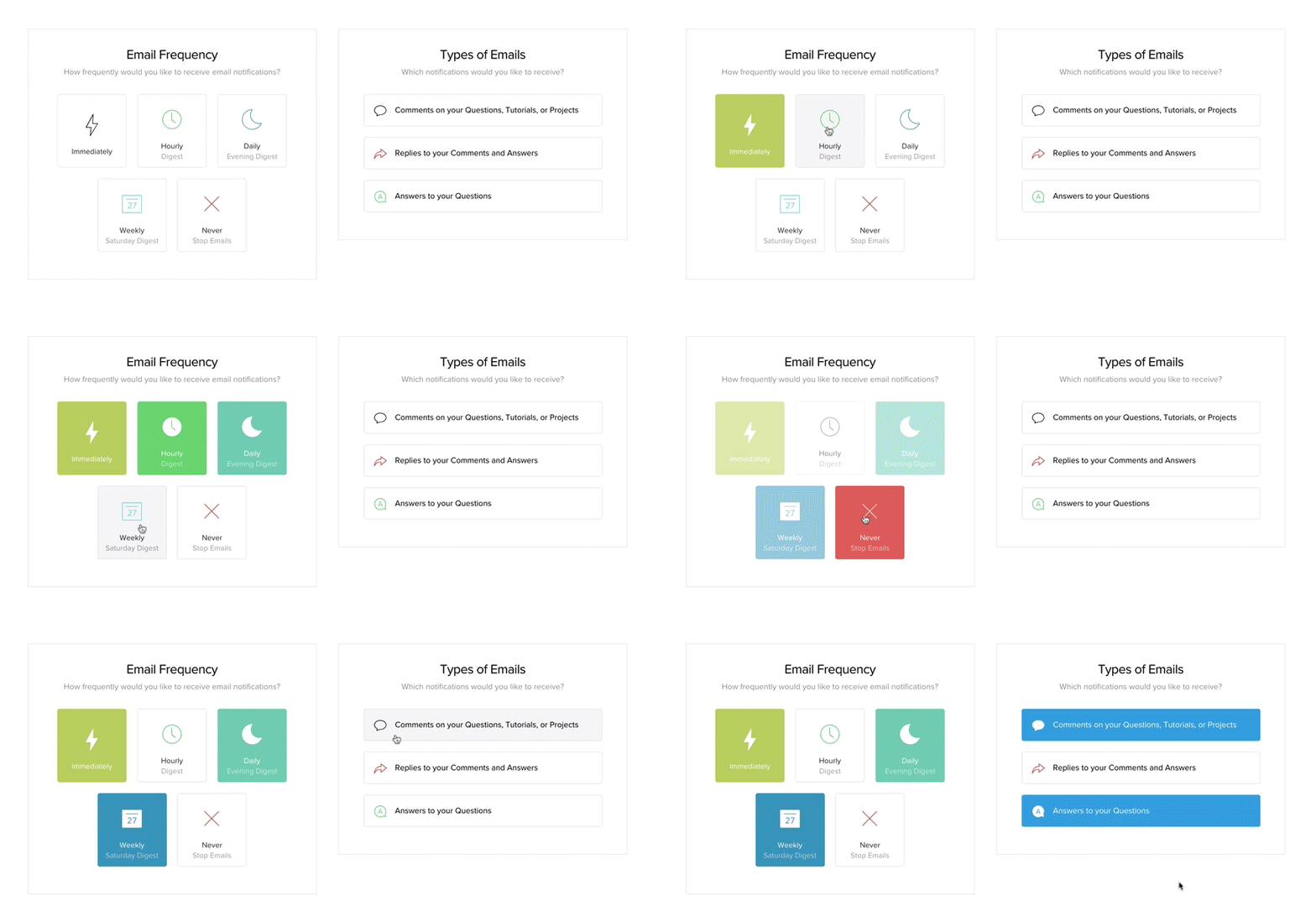 Changing frequency and types of notifications
Outside of notification settings, users can manage all of the content they are subscribed to in one easy place for quick changes to subscriptions.
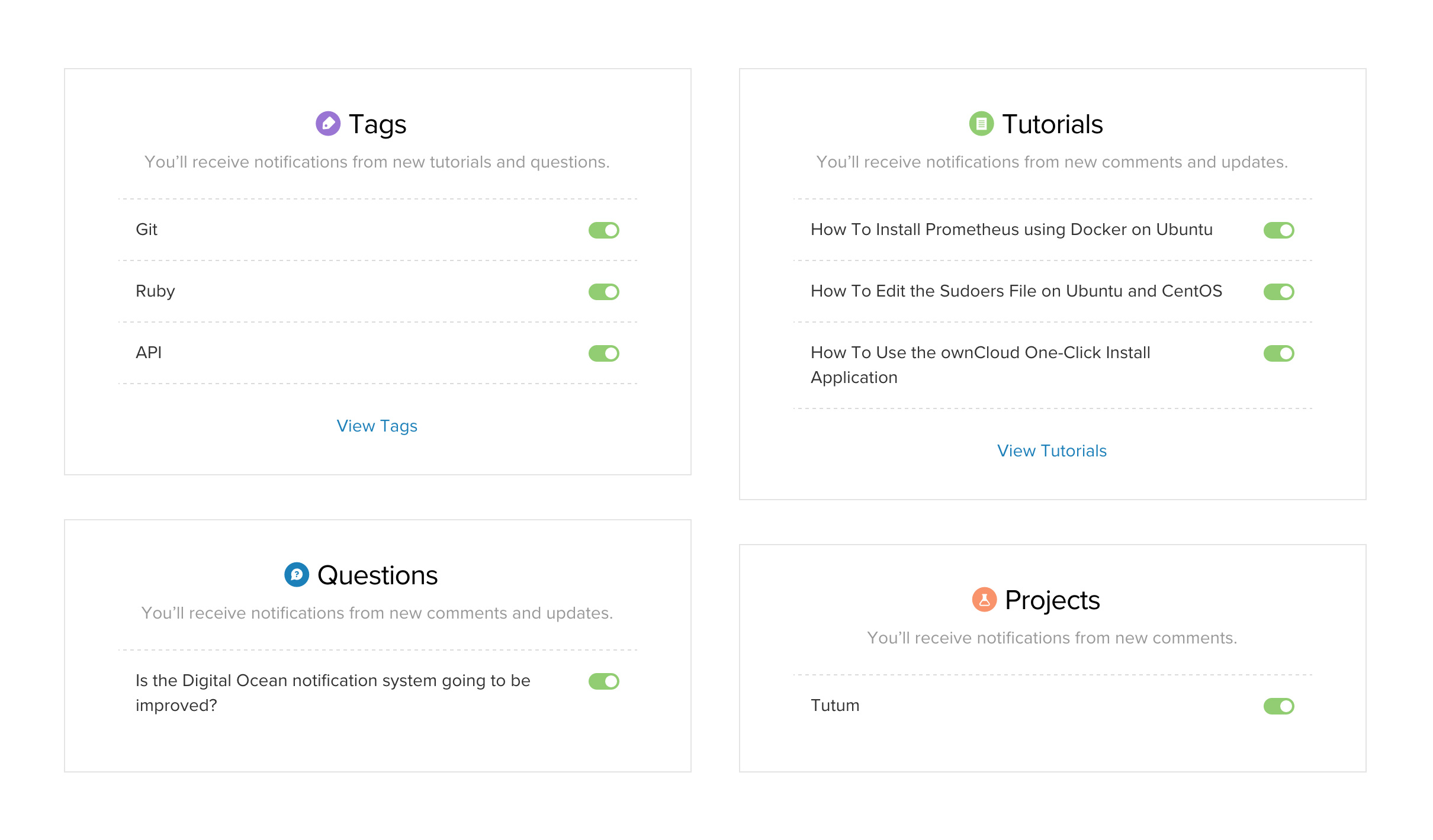 Subscriptions are managed via quick toggle
After settings and subscriptions are set, a user manages the notifications through the "alerts" dropdown. Notifications are considered ‘acknowledged’ if they are viewed by the user. If a user has many notifications in the dropdown, they are ‘acknowledged’ as soon as they are visible in the dropdown viewport. The background color fades from blue to white, affording the acknowledgement.
{image of notifications dropdown}
Moving Forward
While the above features serve as a fantastic foundation for future development, we have aready seen major increases in traffic, signups, engagement, conversion to Cloud, and most importantly, love from the community:
Tweets from community users
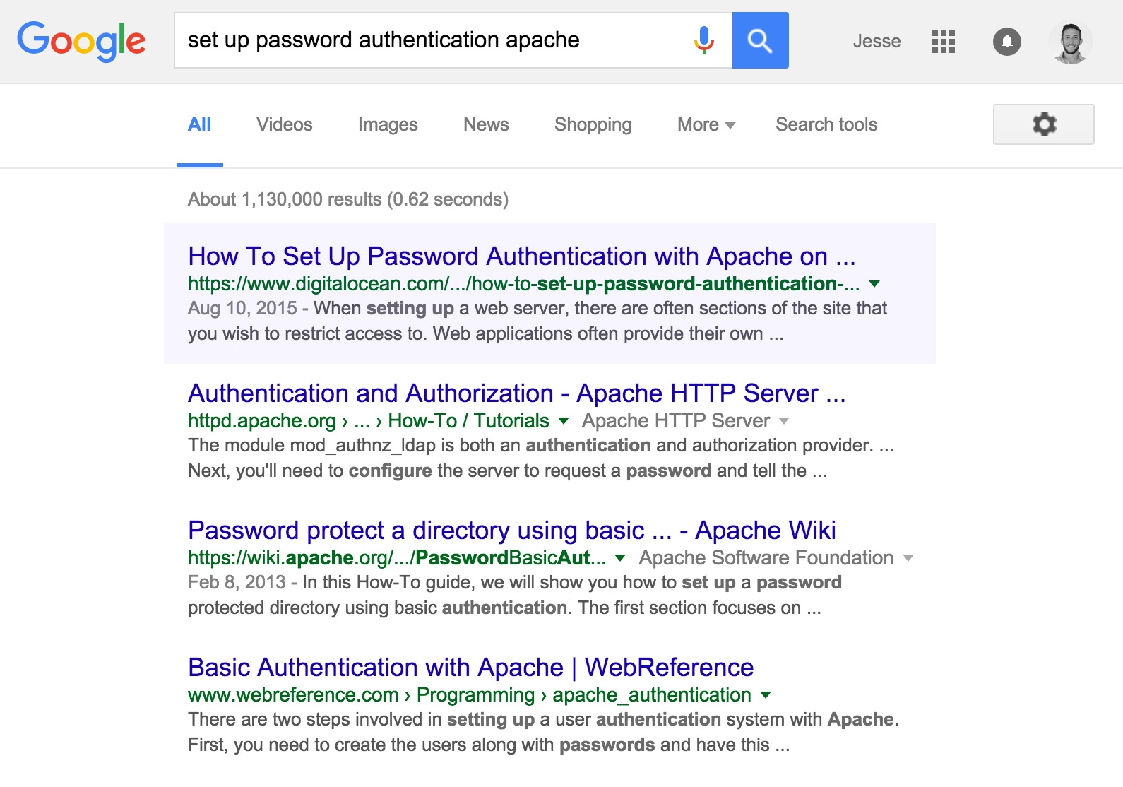 Google likes community content :)
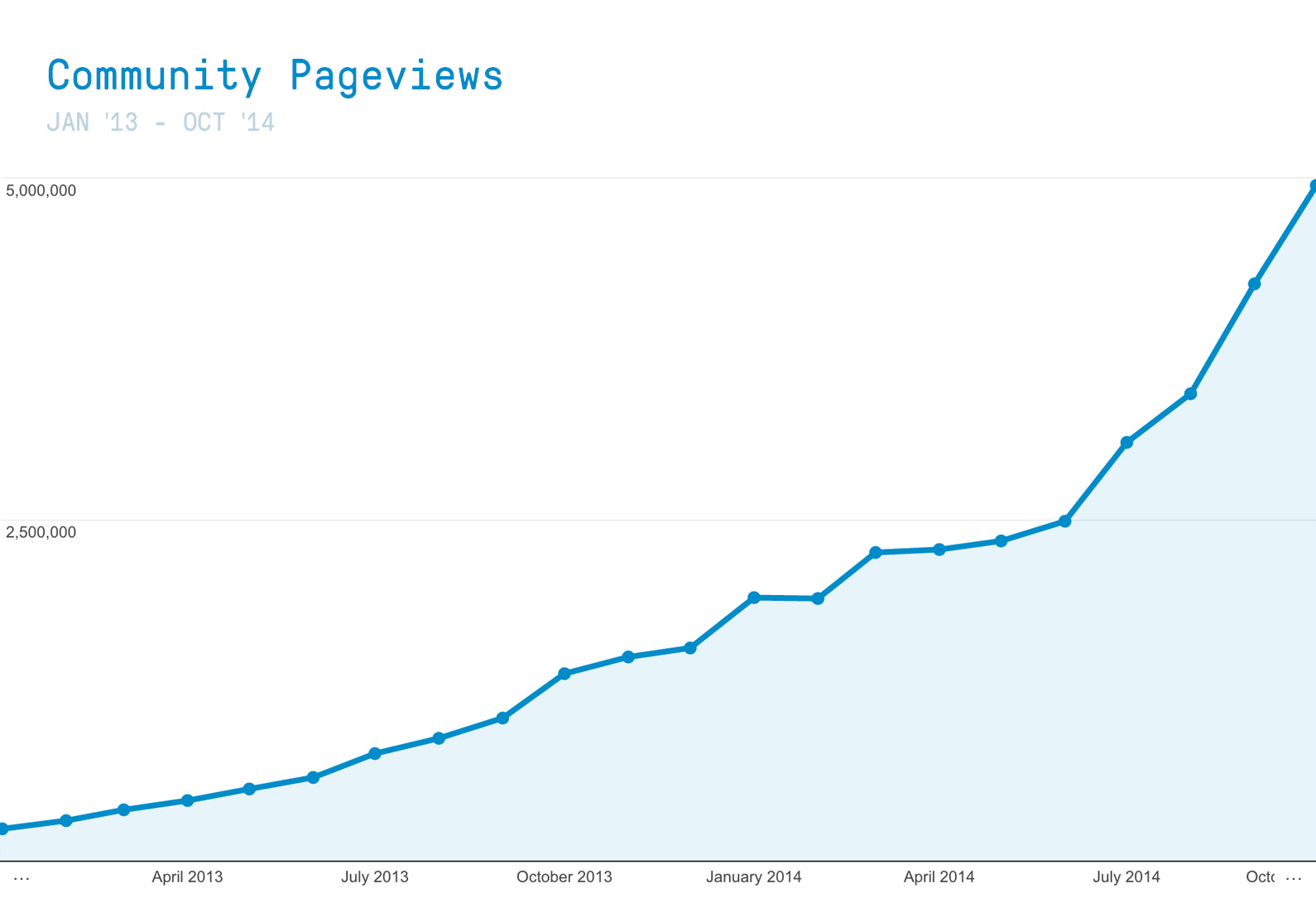 Page views at 5M/mnth
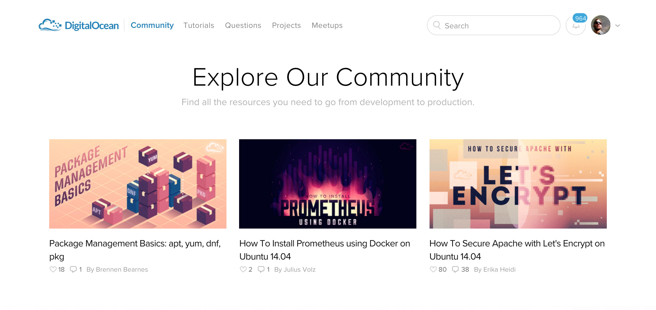 Go on, explore!
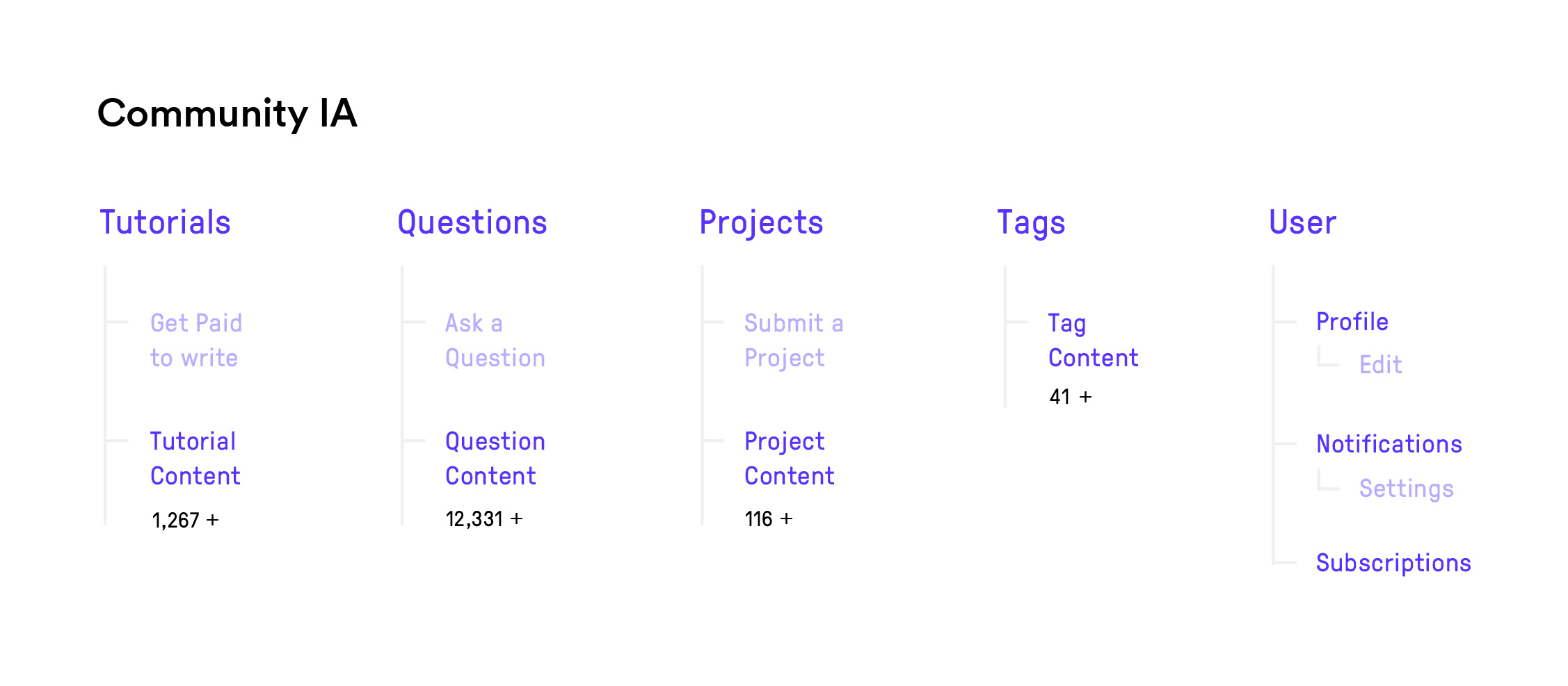 Community Sitemap
 Community Q&A
 Community Projects
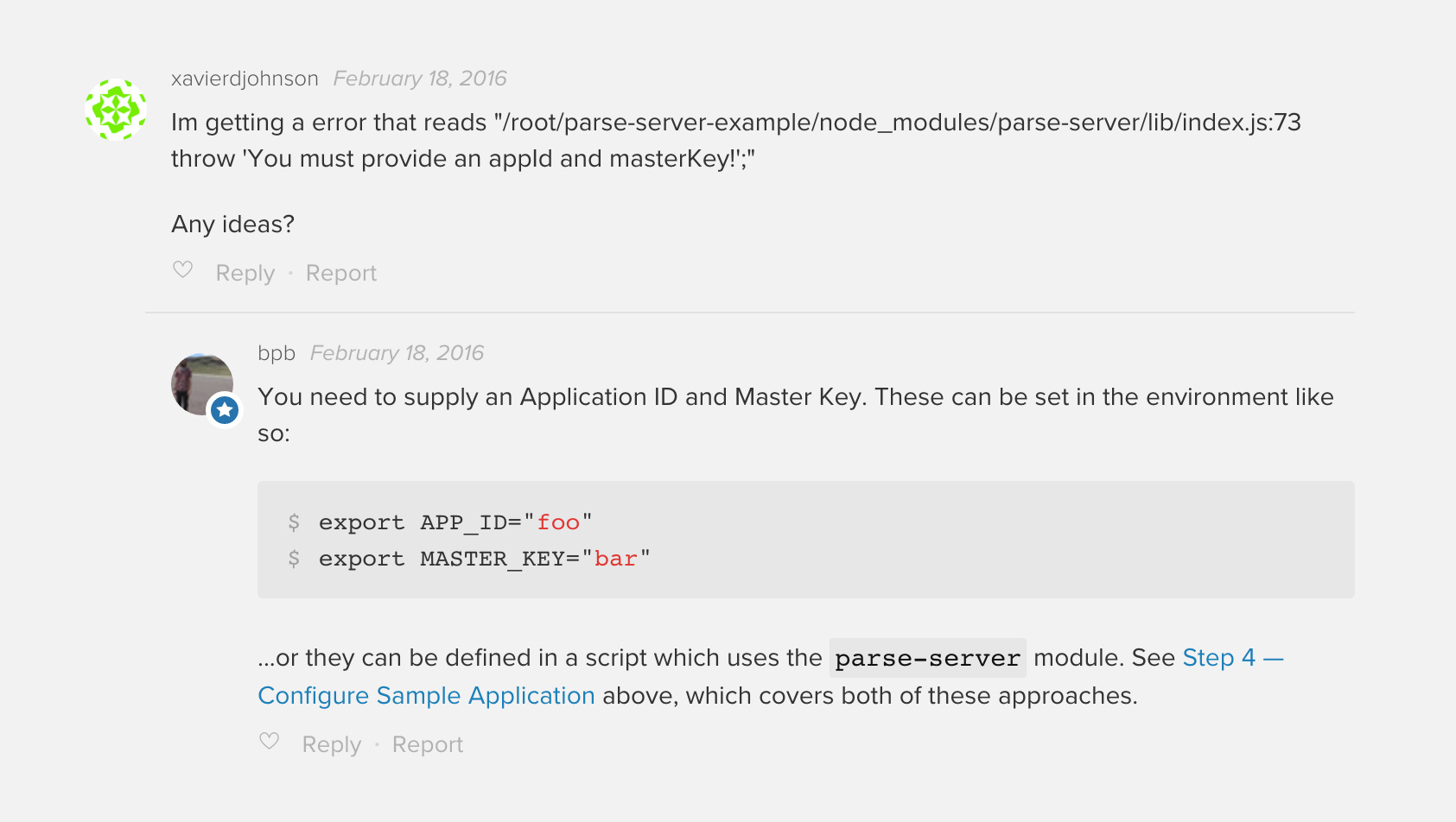 A threaded comment
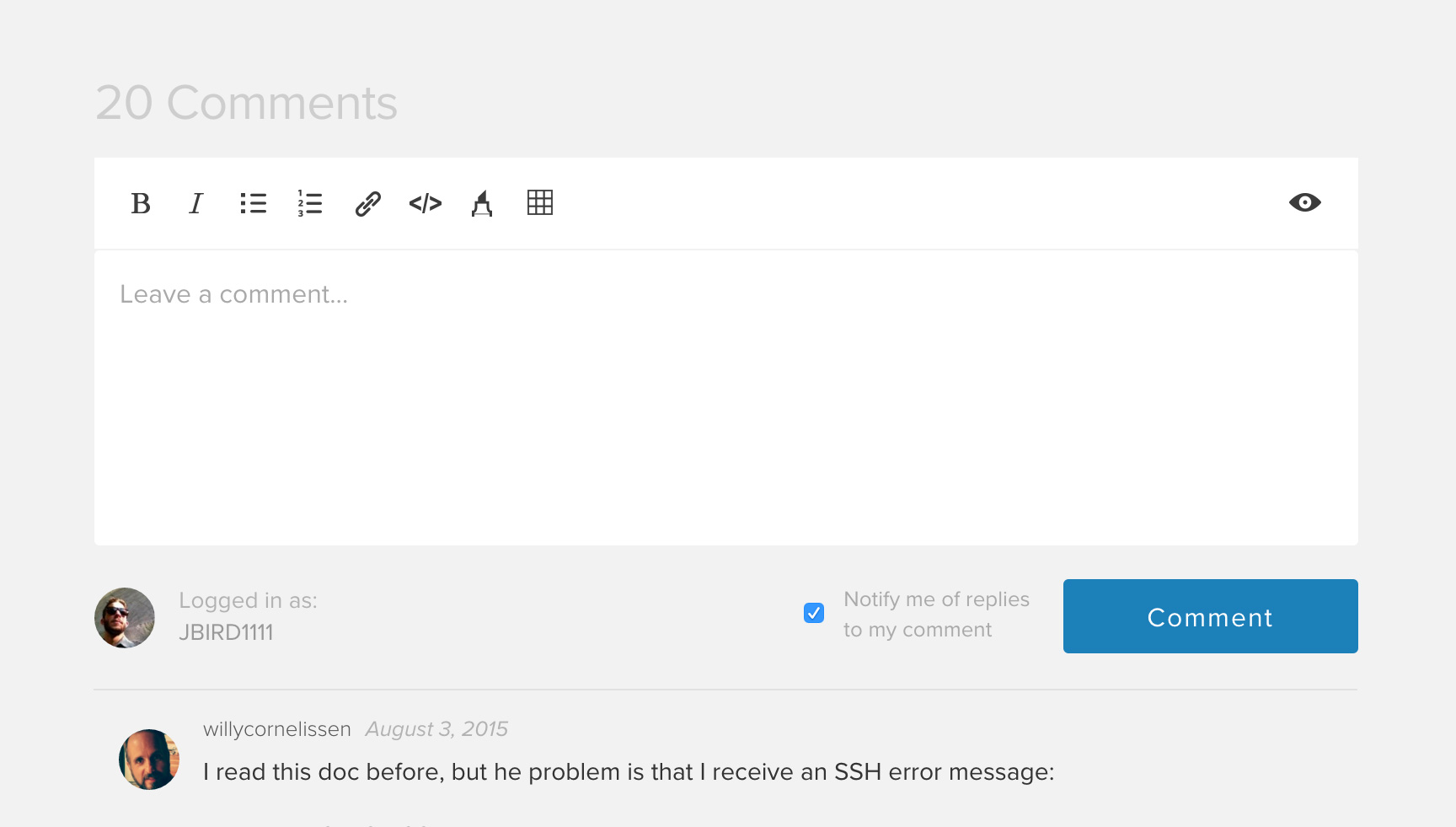 The comments wysiwyg editor
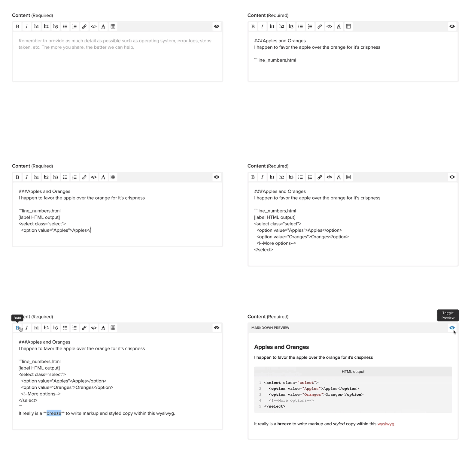 The wysiwyg editor in action
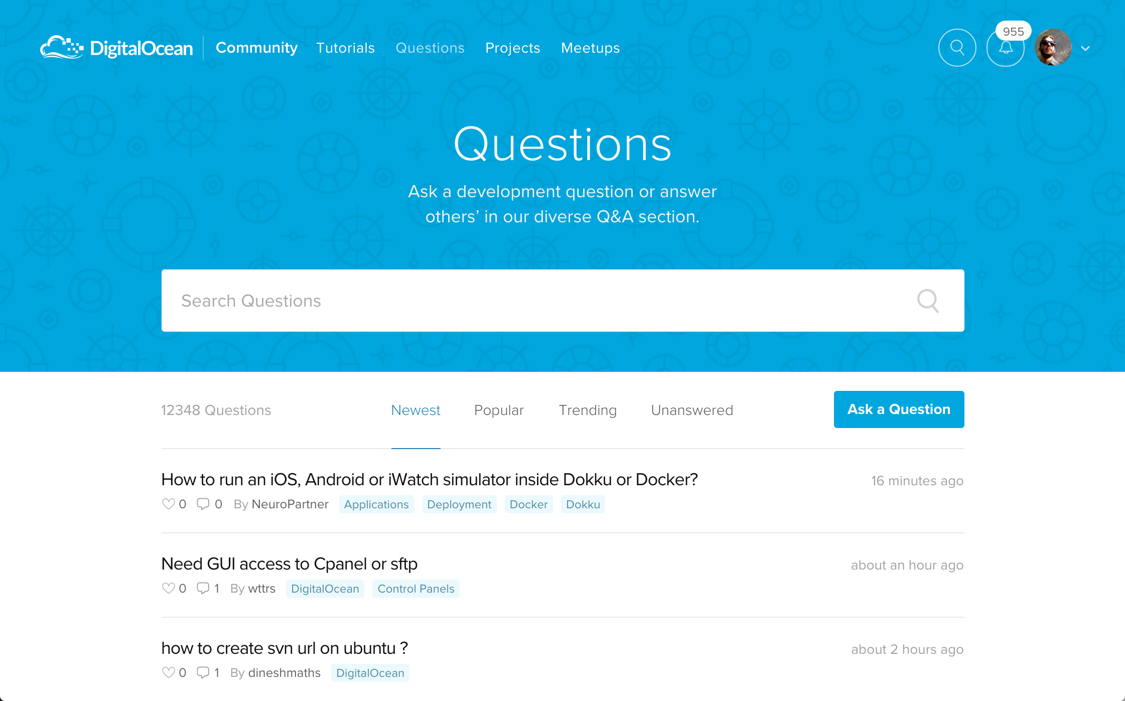 The questions portal
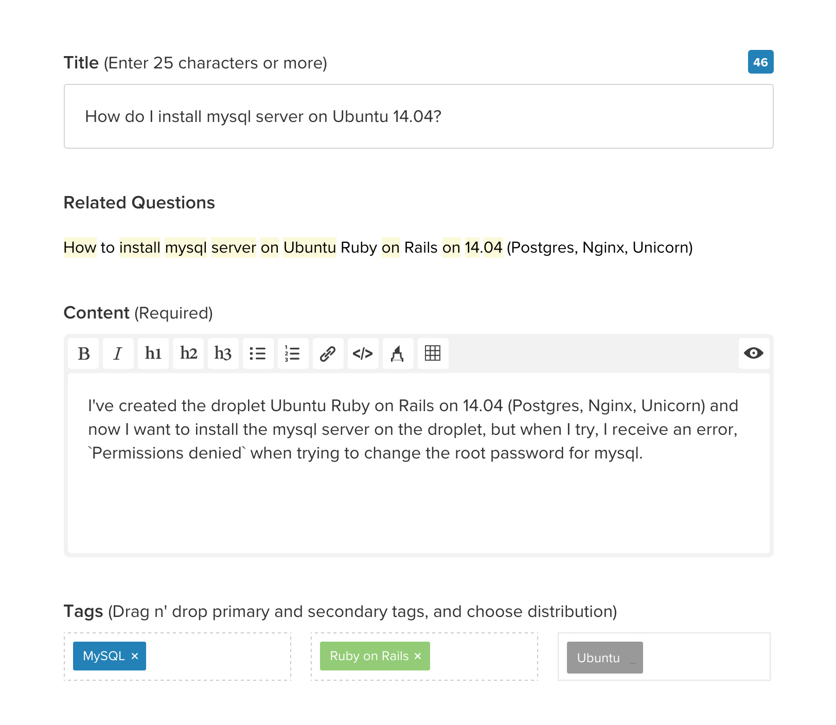 Asking a question
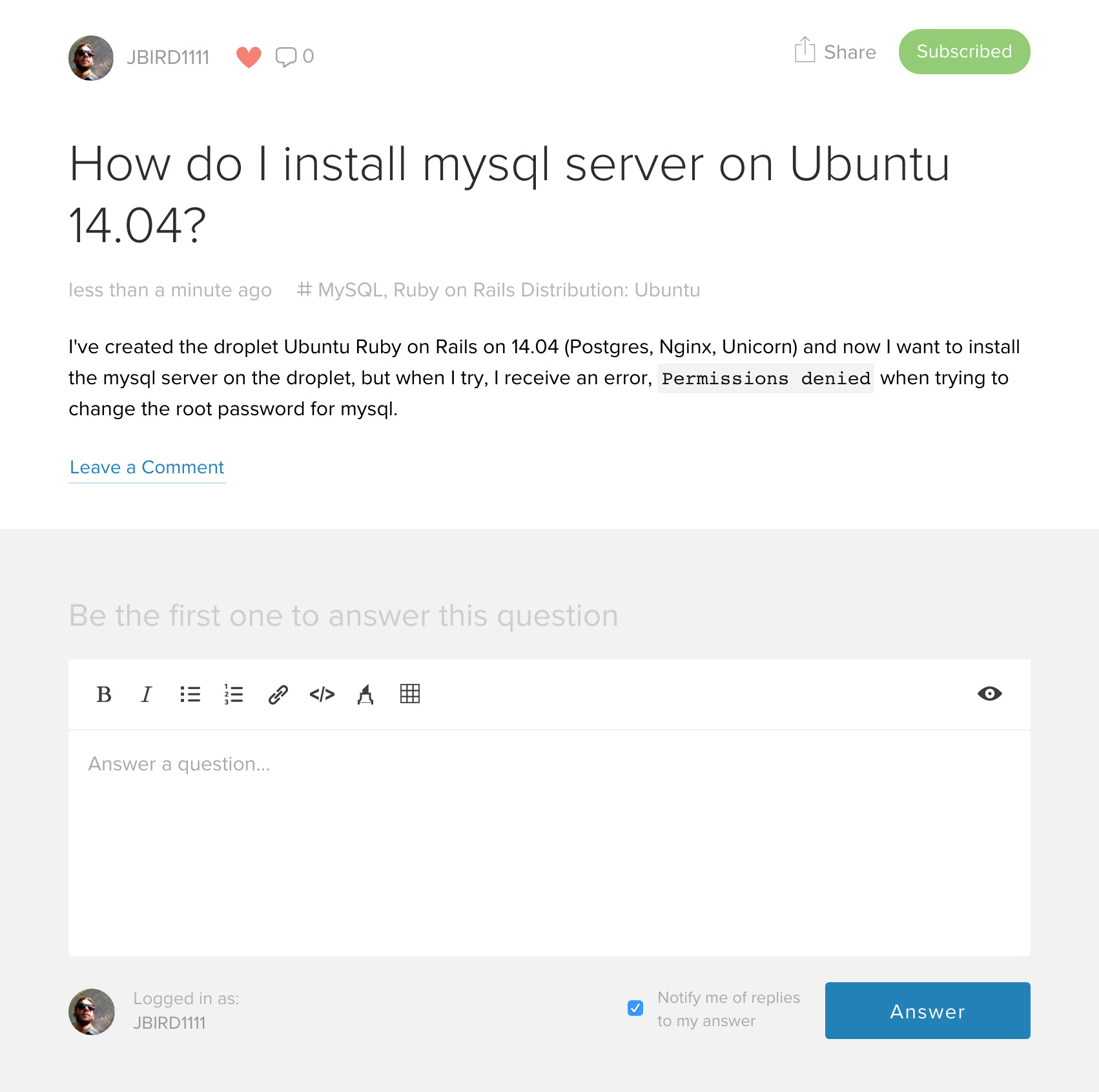 Question after asking
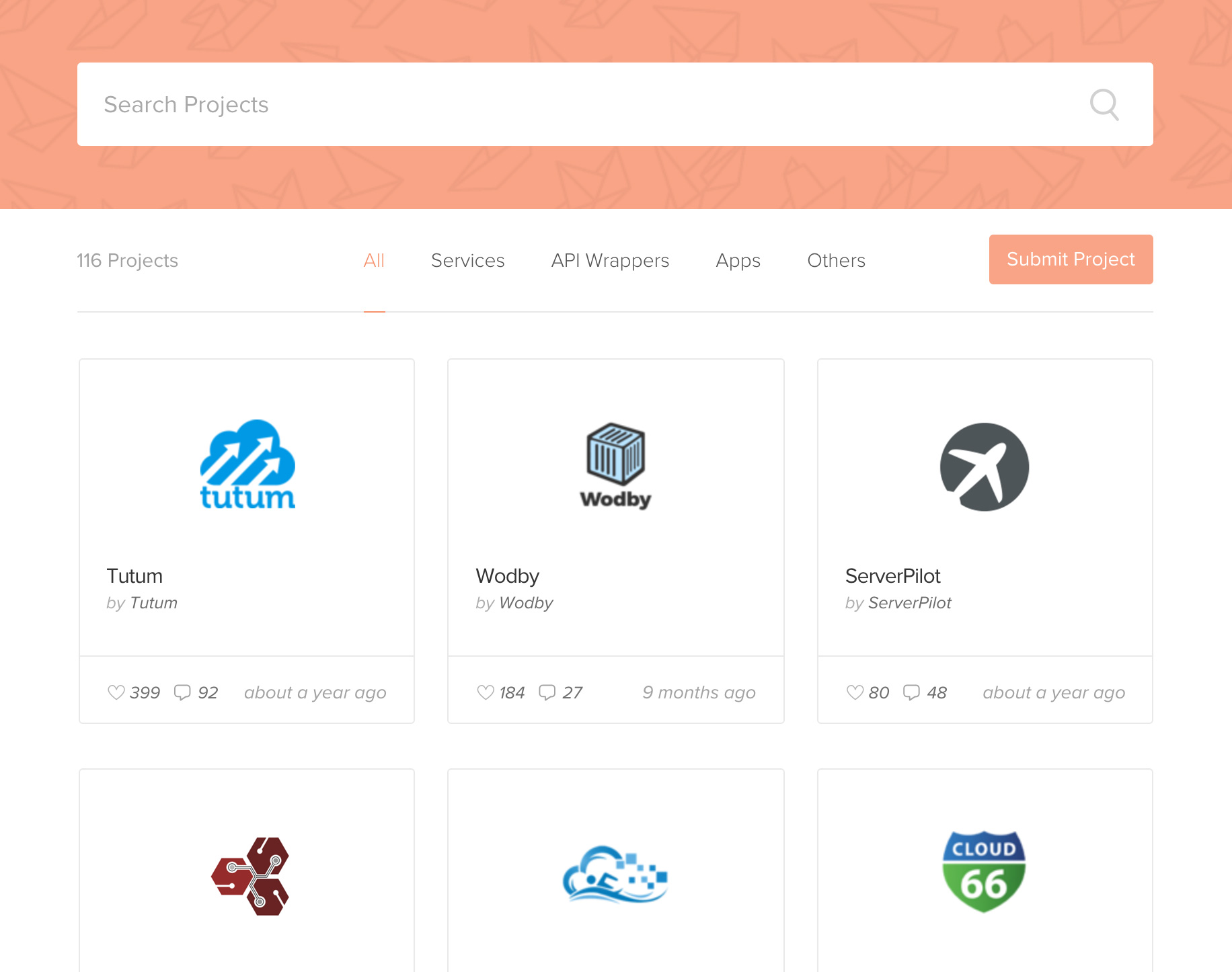 The projects portal
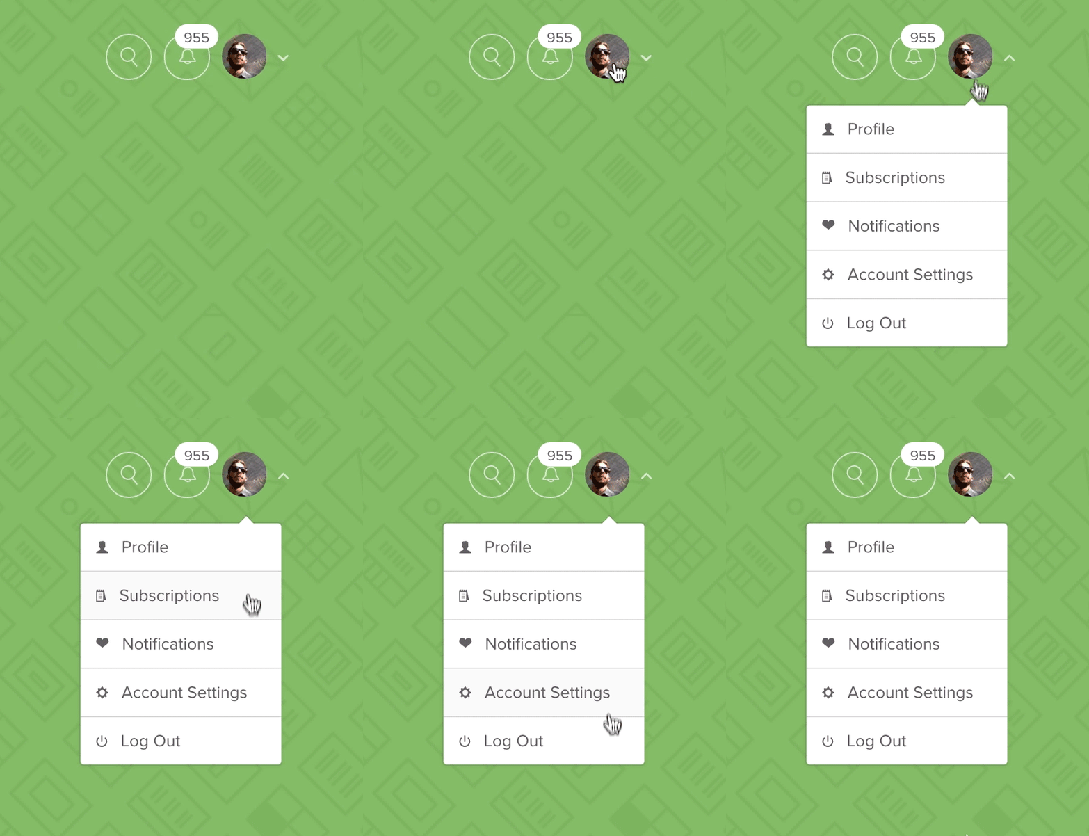 User contextual menu
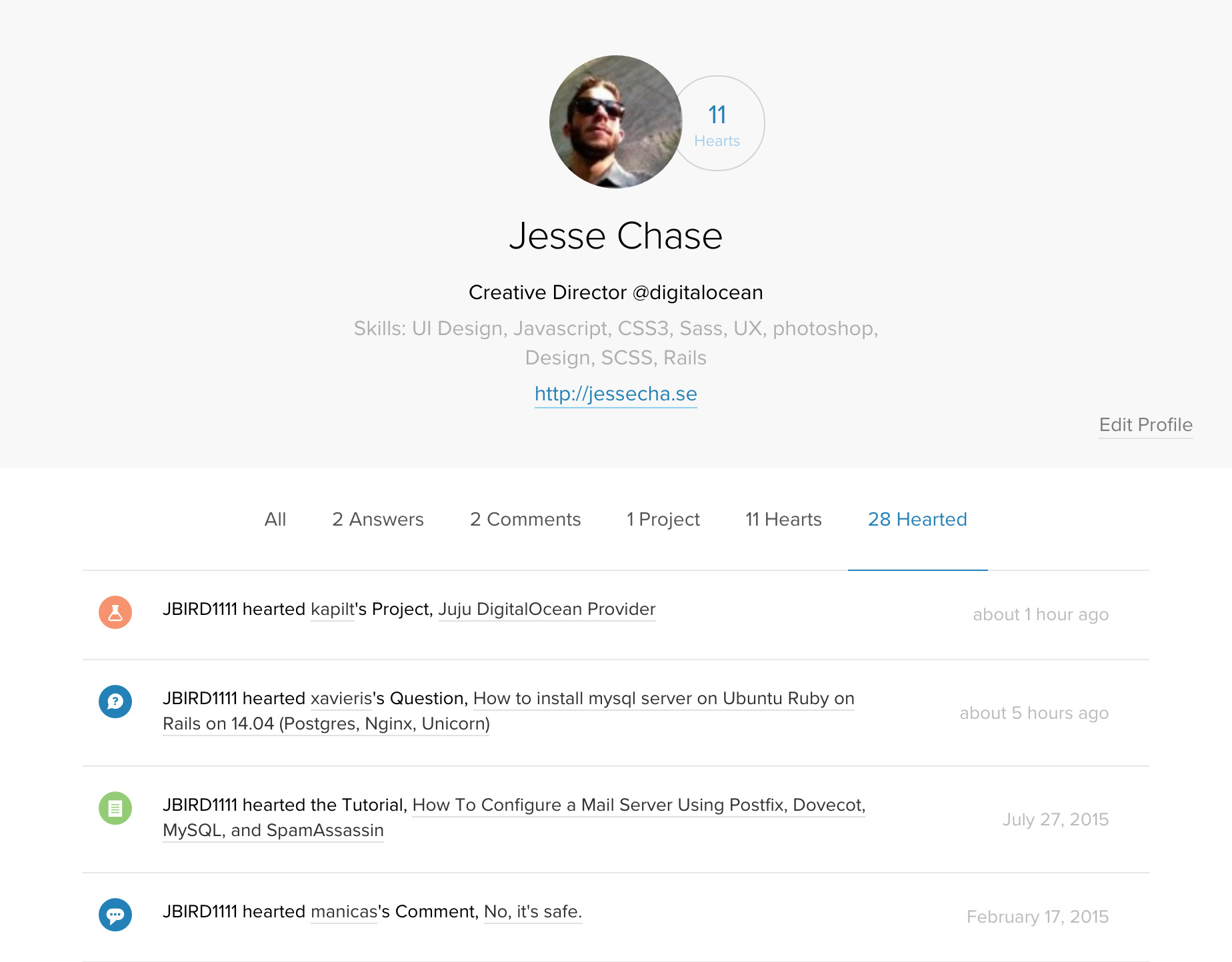 My profile screen
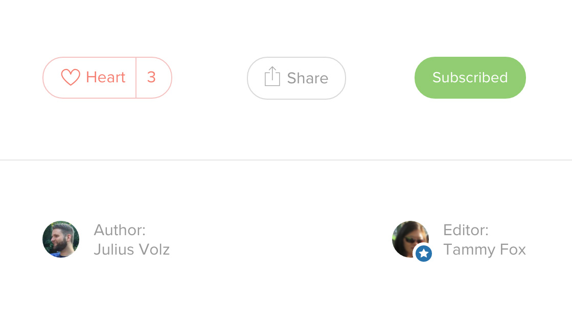 User is subscribed to content
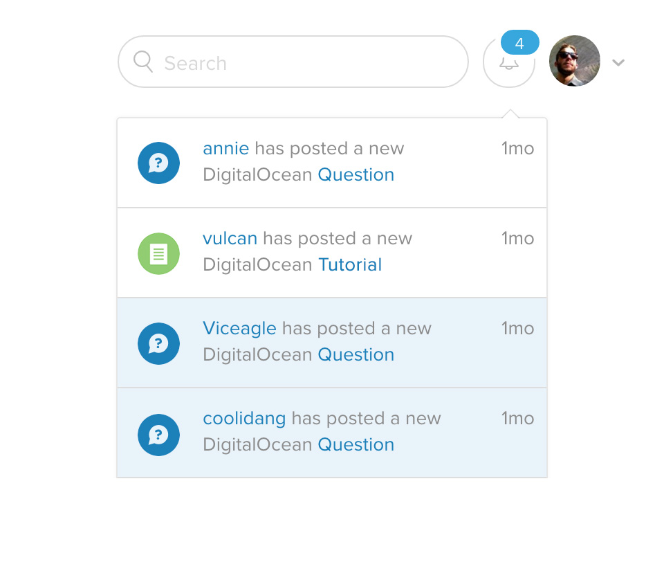 Notifications are managed via dropdown