Maintaining a messy codebase can be is an absolute nightmare. There was a point in time where the DigitalOcean Cloud had an extremely unruly set of CSS files and no set standards for writing front end code. Almost every style was scoped to an individual component on an individual page and styles were far from consistent. There were over 40 different shades of blue, redundant JS libraries were used, markup and styles were written in different languages, and naming conventions were a mess…it was a disaster.
Maintaining a messy front endcan beis an absolute nightmare.
At the time, DigitalOcean was planning on shipping some major additions to our product, but I was uncomfortable proceeding without a strong handle on the front end. We were in dire need of a set of standards and methodologies to guide us in the design and build of our product. So with the help of my team, I set out to build a style guide that conformed to a logical set of design beliefs and patterns.
 The Buoy Logo
After research and benchmarking, I had an idea of how to architect Buoy. It would be comprised of Layout Modules, Elements, Components, and Utilities. Through these collections, a designer has an understanding of the pattern library and a developer could quickly and easily code the designer's work. Layout would house the page structure like grids and whitespace, Elements would house individual elements like buttons or inputs, Components would house the interactive elements like modals or tabs, and Utilities would house utility helpers like a clearfix or text align utility.
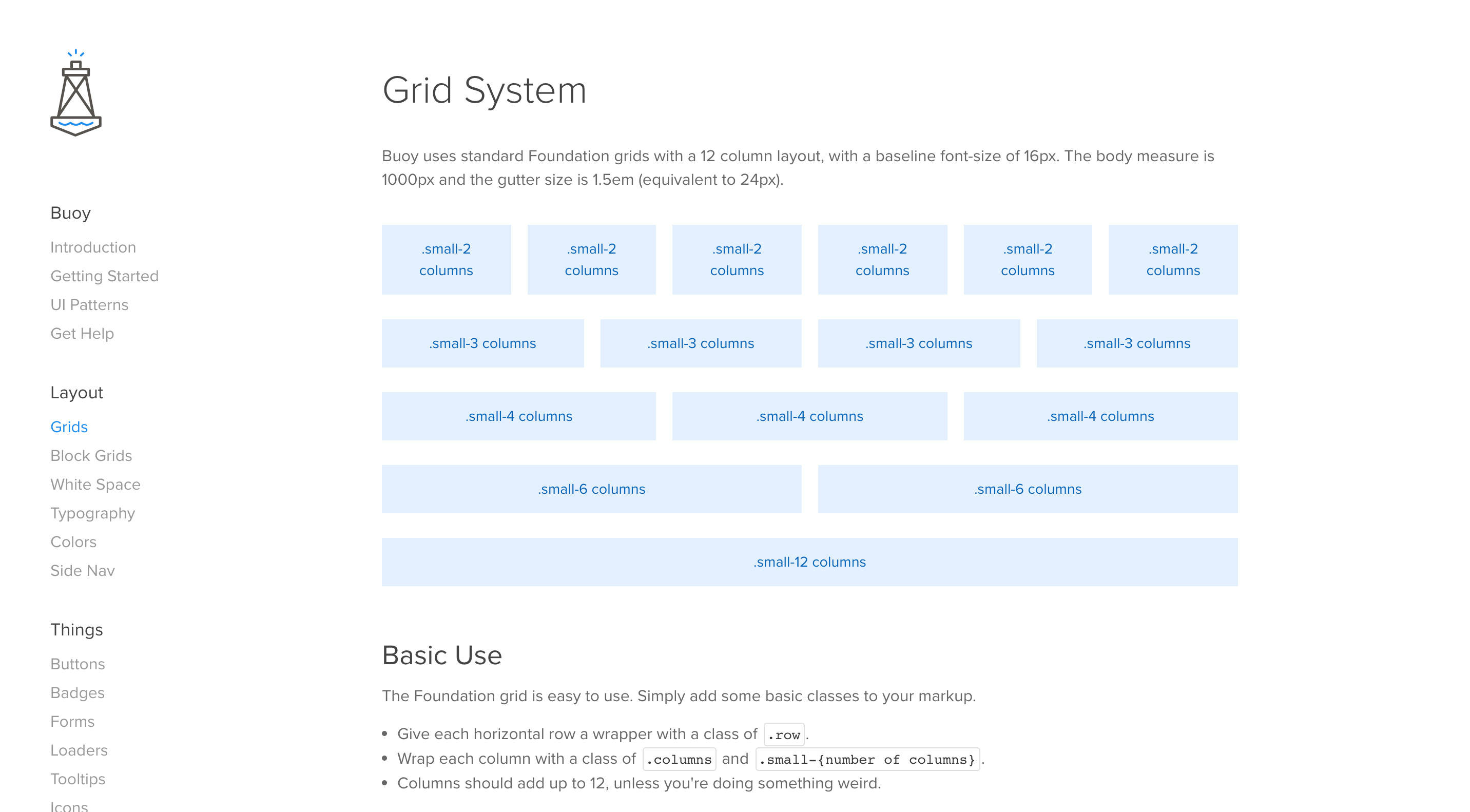 Buoy grid layout page
These four units were created after conducting a thorough audit of our cloud: what patterns were currently used, where were the inconsistencies, and how can everything be brought together into a series of UI patterns that would improve the overall experience? Before building out these patterns, we had to agree upon a set of goals for the project:
App Agnostic
Buoy needed the ability to be shared across many projects. This meant that it had to live in a location outside of a particular app. This also meant that Buoy should not be restricted by a particular stack or framework (Node versus RoR). Buoy also needed to be flexible and to allow for an ‘a la carte’ selection of components or elements for use in different projects.
Remove CSS Specificity
While scoping (nesting) CSS is important on the component level, Buoy believes that all elements and components should be available and shareable anywhere within a project. As a consumer of Buoy, you should never have to battle style specificity or to create overrides. All Buoy components and elements are left relatively un-scoped so they are easy to use and maintain.
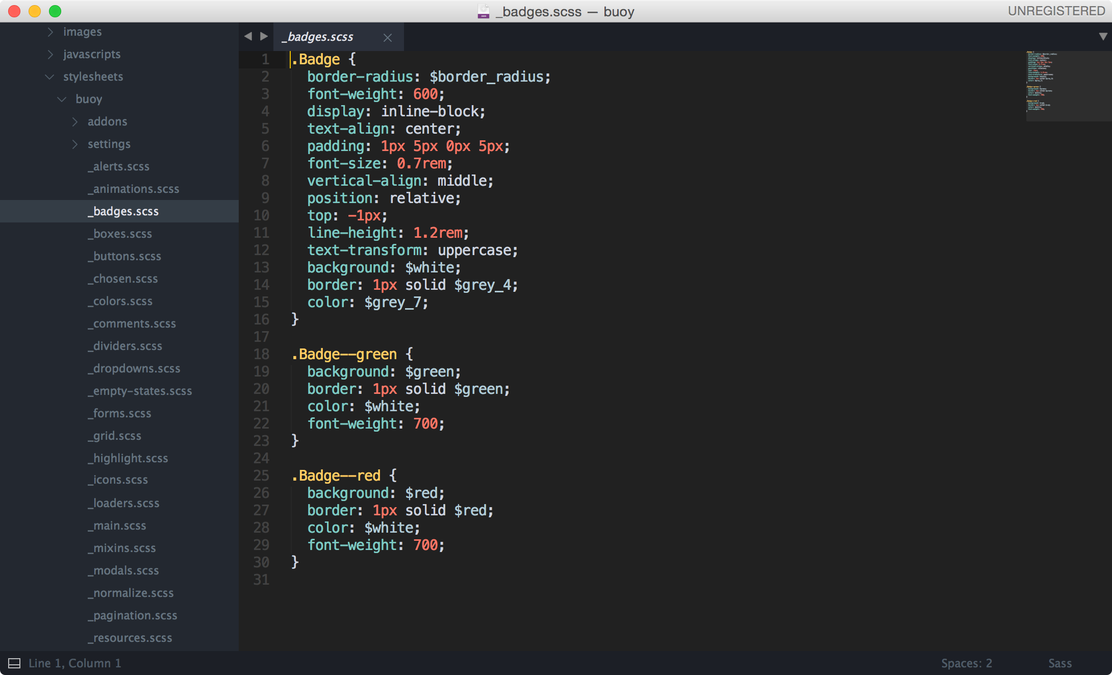 Unscoped css in badge element
As a consumer of Buoy, you should never have to battle style specificity or create overrides.
Highly Maintainable
Buoy should not be difficult to maintain. Buoy consolidates all reusable components in a single place and promotes DRY (don’t repeat yourself) which makes updating components a much simpler and safer task.
Utilizes BEM Markup
Buoy is written in an object oriented CSS methodology called BEM, which stands for Block, Element, Modifier. We have adopted Nicolas Gallagher's naming scheme, SUIT. To people unfamiliar with BEM, this may seem odd or superfluous. As far as maintainability is concerned, it is extremely easy to identify what a selector represents by it's class name. For instance, a modal's class is .Modal. The header of a modal (a modal’s child) is .Modal-header. Lastly, if we wanted a smaller version of a modal (a modifier) we would name it .Modal—-small. This type of naming convention feels very natural and is indicative of a selector’s purpose.
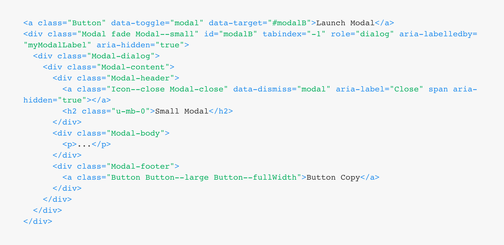 Modal markup
Buoy - Not Just a Style Guide, but a Design System
While buoy provides usable styles and components, it is much more than just a style guide. Buoy has certain baked in ‘beliefs’ that guide us in building product through a design system. The difference between a style guide and a design system is that the latter provides us with architectural or experiential rules that drive how a style guide is used.
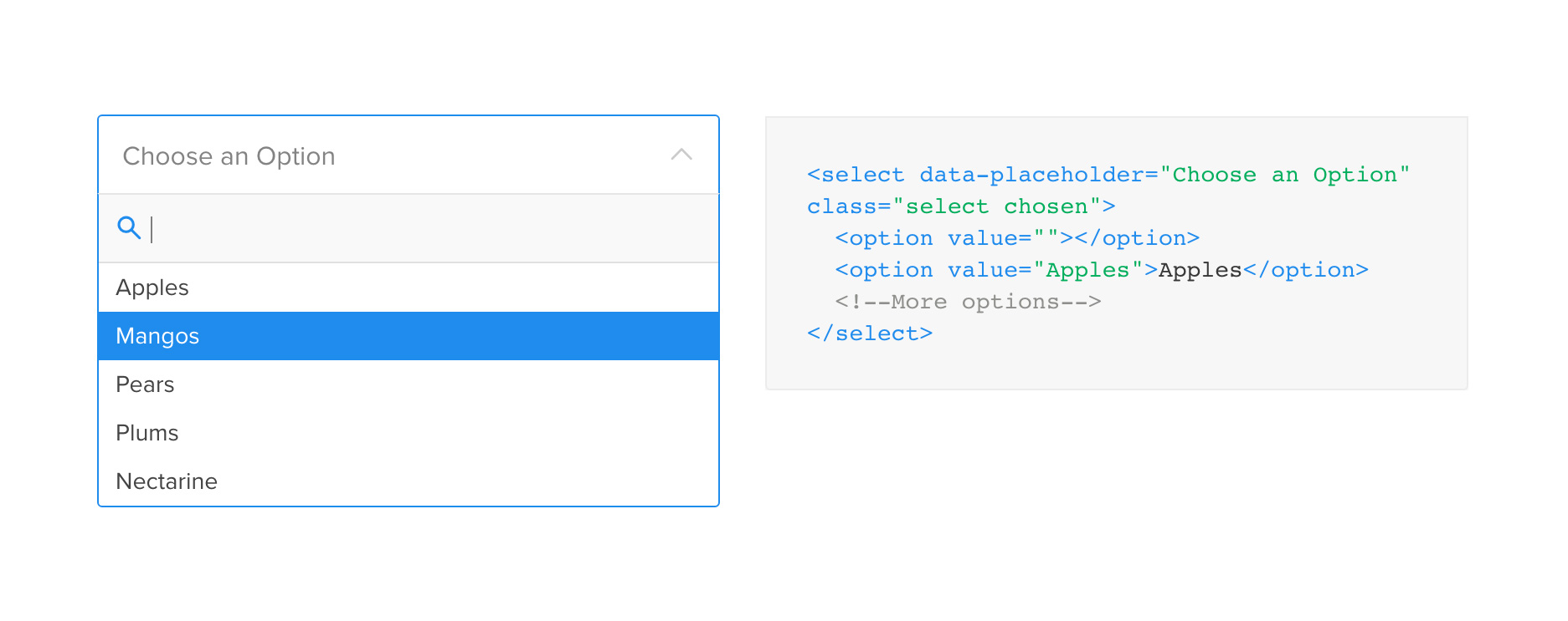 Searchable select element
 Buoy
Buoy
 Buoy
Buoy
Buttons & Colors
The DigitalOcean UI is button-heavy in areas. In an effort not to confuse the user, we should have strict button rules: there must never be more than one primary (blue) button. The secondary (grey) buttons can be used in multiples. Destructive actions (red outline) must include a secondary confirmation dialog. Create (green) buttons are reserved for the creation of objects.
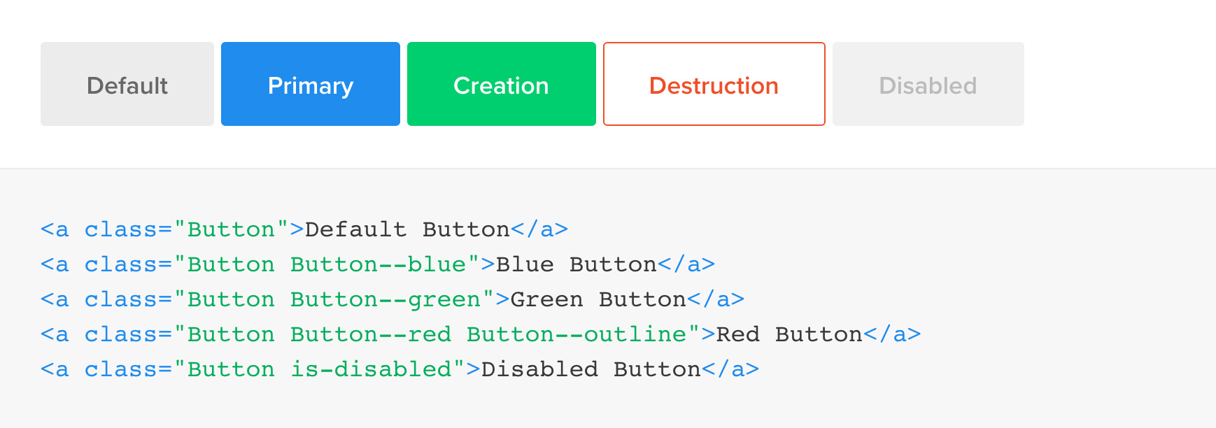 Buoy buttons
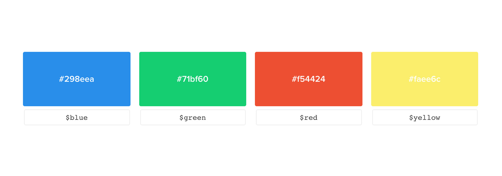 Buoy Colors
Objects
Anything related to infrastructure is an object. An object is a ‘thing’ that has a series of visually consistent metadata relating to the parent object. As the product grows and we have many objects, it is highly important that we use the same visual language across these products.
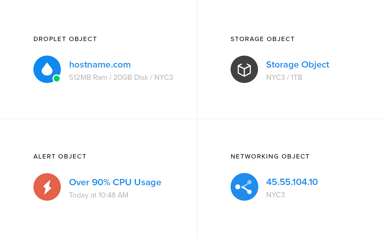 Buoy Objects - NOTE: these are not actual objects used in DigitalOcean UI
Structural Elements
The DigitalOcean UI is very white and airy which creates the need for structure among elements and components. Buoy takes advantage of the box to create structure across the interface. Because boxes are visually similar to form inputs, non interactive boxes are 2px and form inputs are 1px.
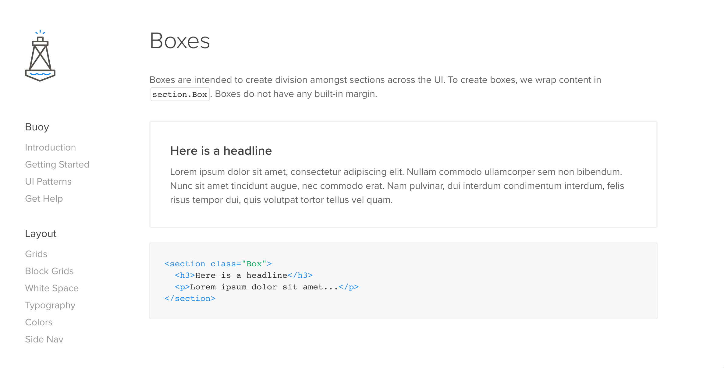 Buoy Boxes
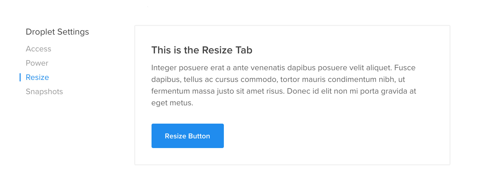
Component Rules
Components are a series of elements with interactions based on user action. Let's say we are building a new product and we have a need to tuck information away until the user interacts with it. We could take advantage of a tooltip, a revealer, a modal, an alert, or a dropdown. Rules are applied to each component so it can be used for a particular purpose. This lends itself to creating consistency and the most usable pattern for a need. In many cases, if a component feels forced into a particular addition, we may go to the drawing board to create a new component pattern.
 A series of components working together
So I Built A Thing
With knowledge of the problems that Buoy can solve we can understand how Buoy would work in our product, and what types of patterns Buoy tackles. Using Middleman, I built an app that allowed us to quickly and reliably generate pixel perfect interfaces in a fraction of the time it took previously.
Aside from ease-of-use, Buoy represents a great overhaul in the look and feel of our product. The structural and visual changes alone represented a major facelift in the appearance of the product. But what excited me most was the improvement in the user experience. The DigitalOcean product became exponentially easier to use because of the Buoy adoption. The patterns are intuitive, the visual language is consistent, and the copy was fun, informative, and playful.
Tweets after we launched Buoy on Cloud
Implementing Buoy
So how does one implement a style guide on an extremely messy codebase? How do we remove tens of thousands of lines of Sass and Haml and replace it with a shared style guide in small, calculated steps? I will not go into great detail, but its important to understand that these changes needed to be released in incremental steps over the course of a few weeks. Introducing a brand new CSS codebase on top of another can result in some major conflicts. When you have a heavily scoped v1 CSS codebase, and an unscoped v2 css codebase, v1 will win the war due to its high level of specificity. Due to this, we converted each page on Cloud to Buoy, using a system of flags, uses_v2: true. Based on this flag, each page pulled from v1 or v2 codebase, but never both.
Although we ran into some conflicts, the transition was fairly seamless: before we knew it, we had a shiny new cloud to show off. On the day Buoy was merged into Cloud the feeling was one of pure victory. It represented a mass destruction of tens of thousands of lines of ugly CSS and markup.
 A quick and dirty build of a form UI with no extra css.