The sign up bottleneck
Blue Apron approached me with a problem, “Our sign up conversion rate stands at 7%, and we are missing out on valuable business.” Blue Apron recognized that they had a major opportunity. If they were to focus on increasing transparency and improving usability of their flow, they could dramatically increase the rate of sign up conversion, representing millions of dollars gained in revenue.
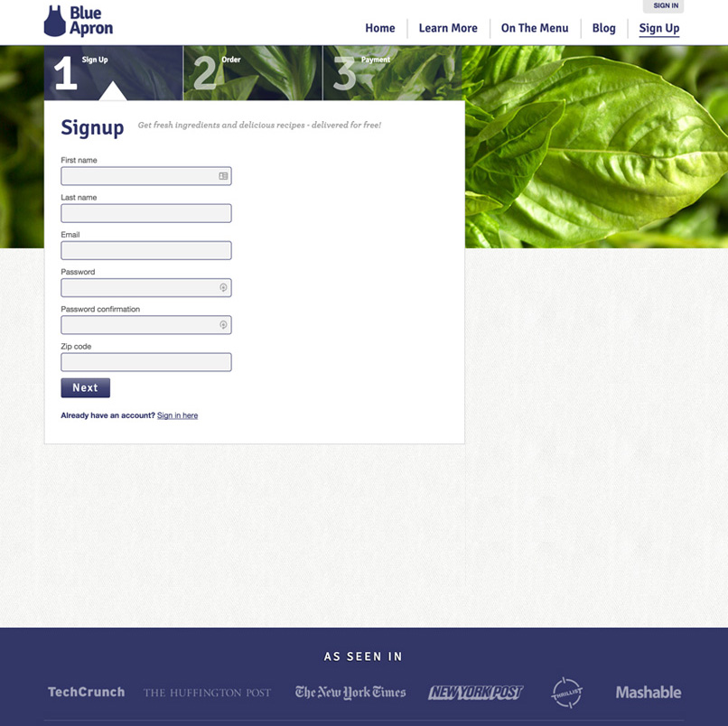
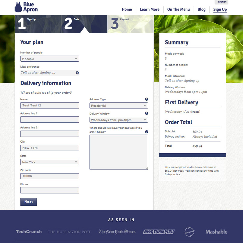
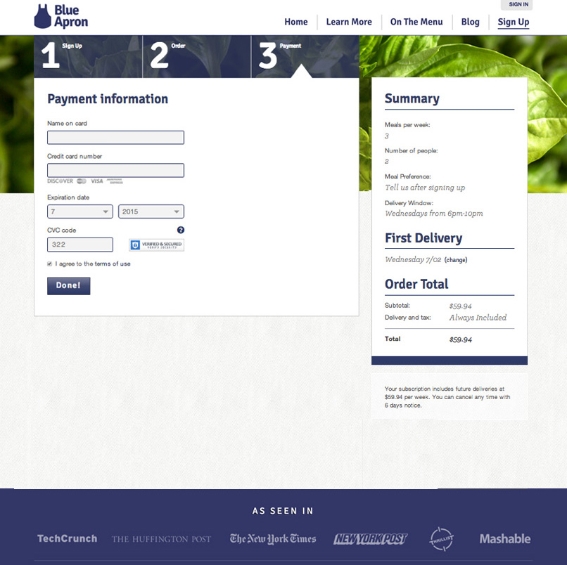
Previous Blue Apron signup flow
Goals
The business goal was to sign on 500 additional active subscriptions per week, which equates to over 17 million dollars in revenue. But how? Blue Apron had not spent time optimizing or understanding their existing sign up flow, so we asked for opinions from 7 users that met the following criteria:
- Not familiar with the product
- Earns over 100k in household income
- Age 25-35
User Interviews
We recorded their sign up sessions, and followed up with user interviews. I will not go deeply into the testing results, but some commons themes surfaced:
- When a user initially signs up, they have major questions on the product logistics. They don’t understand how it works.
- Users are asked to specify dietary restrictions after sign up, not during. The lack of in-flow preferences lead to uncertainty.
- Cost isn’t broken down by serving, requiring users to do the math. Ultimately, users are concerned with cost per meal.
- Delivery ‘windows' did not disclose the window, just the day of delivery.
Through our research, we identified many of the experiential pain points within the flow. Of the users who made it to the final step of the flow, only 42% of them successfully entered their card information and subscribed. So the majority of users who are making it through the first few steps of the sign up flow are leaving! We need to fix this.
I don’t trust the company right now since it’s hiding so much information from me...seems like they’re trying to bait and switch me... - Blue Apron Testing Subject
The project deliverable was a brand new signup flow for both mobile and desktop environments. My role was to strategize, wireframe, and design, ultimately handing off to the Blue Apron dev team.
The New Flow
The updated sign up flow solves most of the problems gathered from our research with a much-improved UI. A clear sense of progress is created with a persistent nav that displays four new steps to the flow: Welcome, Preferences, Delivery, and Payment. This gives the user a sense of context as they navigate through the entire flow. Friendly language and helpers/tooltips are added throughout. Product-related information is added in areas that previously created question or concern. My hypothesis is that users will progress through all four steps without friction, leading to an increase in conversion and a major decrease in dropoff, ultimately delivering the goal of 500 new subscriptions per week.
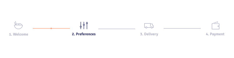 The flow's nav, showing progress from step one ⟼ two
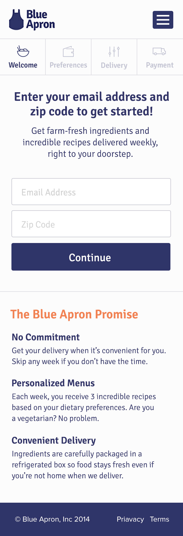
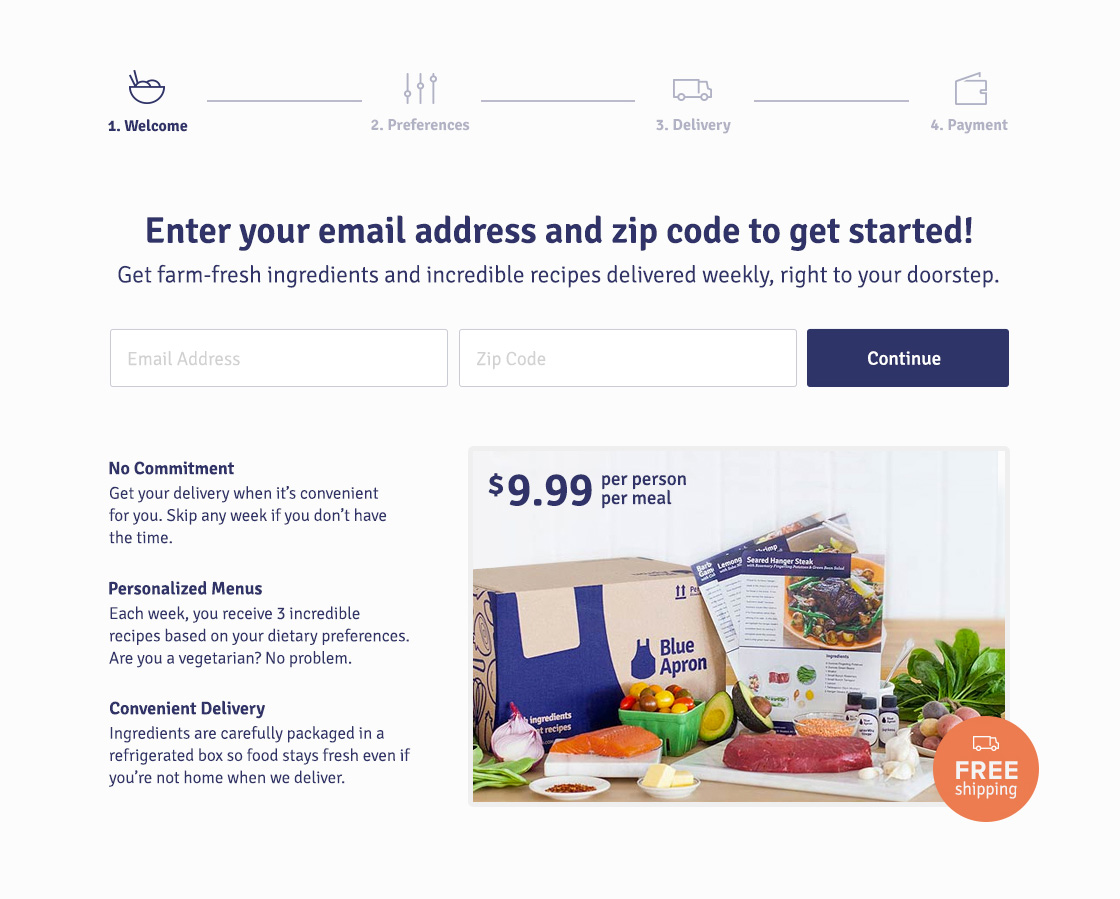
Step One: Welcome
A user may not be comfortable entering personal information until they have answers to a few questions: what, why, when, and how. We cannot assume they have gathered this information from the marketing experience. So while we want a simple, distraction-free flow, we also need to answer these questions in order to allow a user to feel comfortable moving forward:
- WHAT - What is Blue Apron sending me? Can I customize based on my dietary restrictions?
- WHY - Why is this better than going to super market? What is the value?
- WHEN - When will these meals be delivered?
- HOW - How much will this cost me?
 Initial step of sign up flow balances form fields with value proposition
The new welcome screen does away with first name, last name, and password as this information creates friction and is not needed during this step. Names can be collected during shipping and passwords can be collected after payment. The welcome screen simply asks for your email address and zip code, and effectively communicates that Blue Apron is high quality, personalized, inexpensive, and requires zero-commitment. A photo of the packaging and food is displayed with a free-shipping badge. Immediately, users feel comfortable pursuing a subscription as Blue Apron is honest, informative, and friendly.
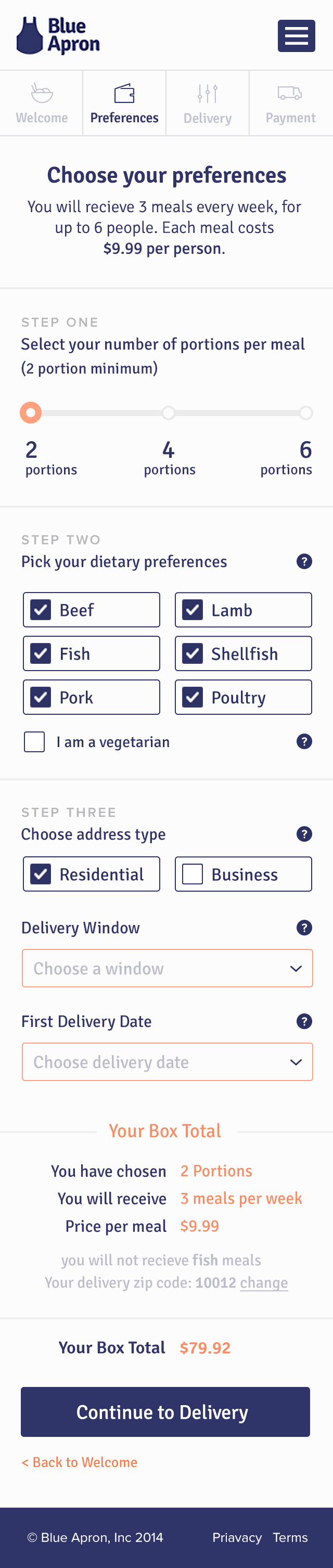
Step Two: Preferences
In version one of the flow, user preferences are not heavily considered. A user could not specify dietary restrictions, nor could they modify their family, food, or delivery preferences in one location. I introduced a new step to the flow, “Preferences” that collects choices relating to the entire Blue Apron experience.
Because the nature of this step is fairly complex, and covers three subjects (family, food, delivery), the UI is broken down into three 'preference-cards’ or sub steps. At the bottom of each card are summaries, which take the user-selected inputs and generates a human readable summary of their preferences. For example, if a user selects vegetarian, fish, and shellfish, the summary might read, “Based on your preferences and our current options, you will receive meals from our pescetarian menu."
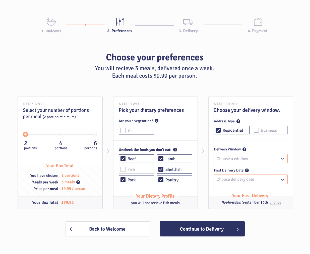 Preferences step of sign up flow
You noticed it! A user can now select the types of foods they cannot eat. Based on the assumption that Americans can eat the majority of the six food groups, I chose to select all by default, and ask the user to ‘Uncheck the foods you don’t eat.” If a user selects Vegetarian, it disables the other options, as none of them are vegetarian-friendly.
There is something fun about this layout. When we tested it, users enjoyed it, and said, "it felt like a game.” The deliberate distinction between items, the minimal number of inputs, and the summaries led to a quick and fun experience. Now that a user has expressed their family, dietary, and delivery preferences, they are ready to dish out some cash and eat some food!
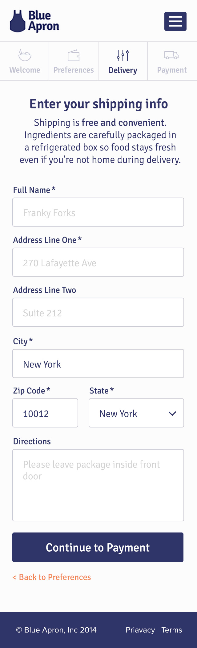
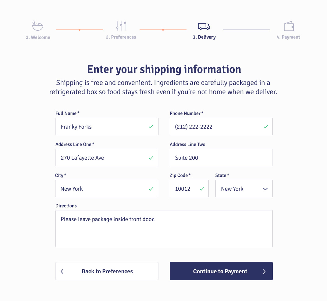
Step Three: Delivery
The delivery section did not deviate substancially from the original page. The major change was the removal of the summary panel and the transfer of preferences to the new preferences step. What is left is a fairly traditional form with name and location inputs. Because we are not at a payment step, there is no need to show the user a summary of their order. Order summaries create a need to review which adds valuable time and often some questions. Let’s save that for the final step.
 Delivery step of sign up flow
Through copy, we reinforce certain facts through the process: we state that shipping is free and that food is packaged in a refrigerated box. This encourages the user and decreases dropoff.
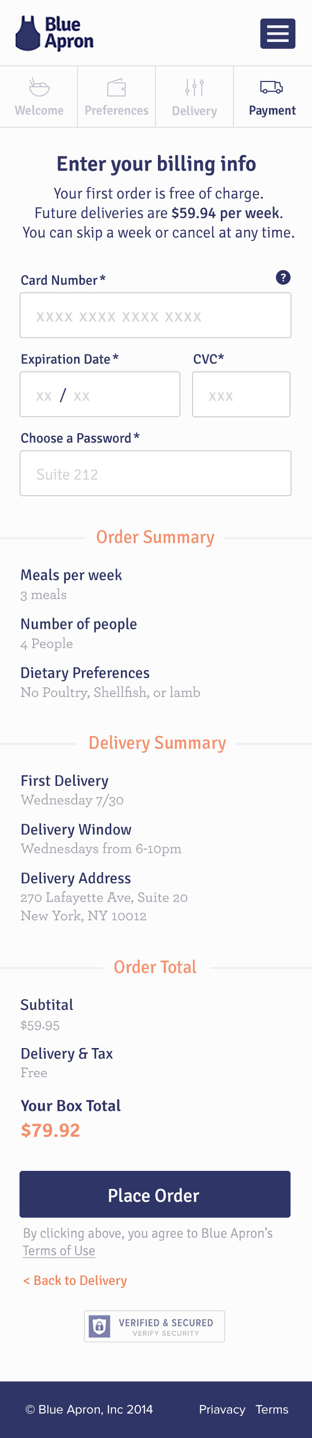
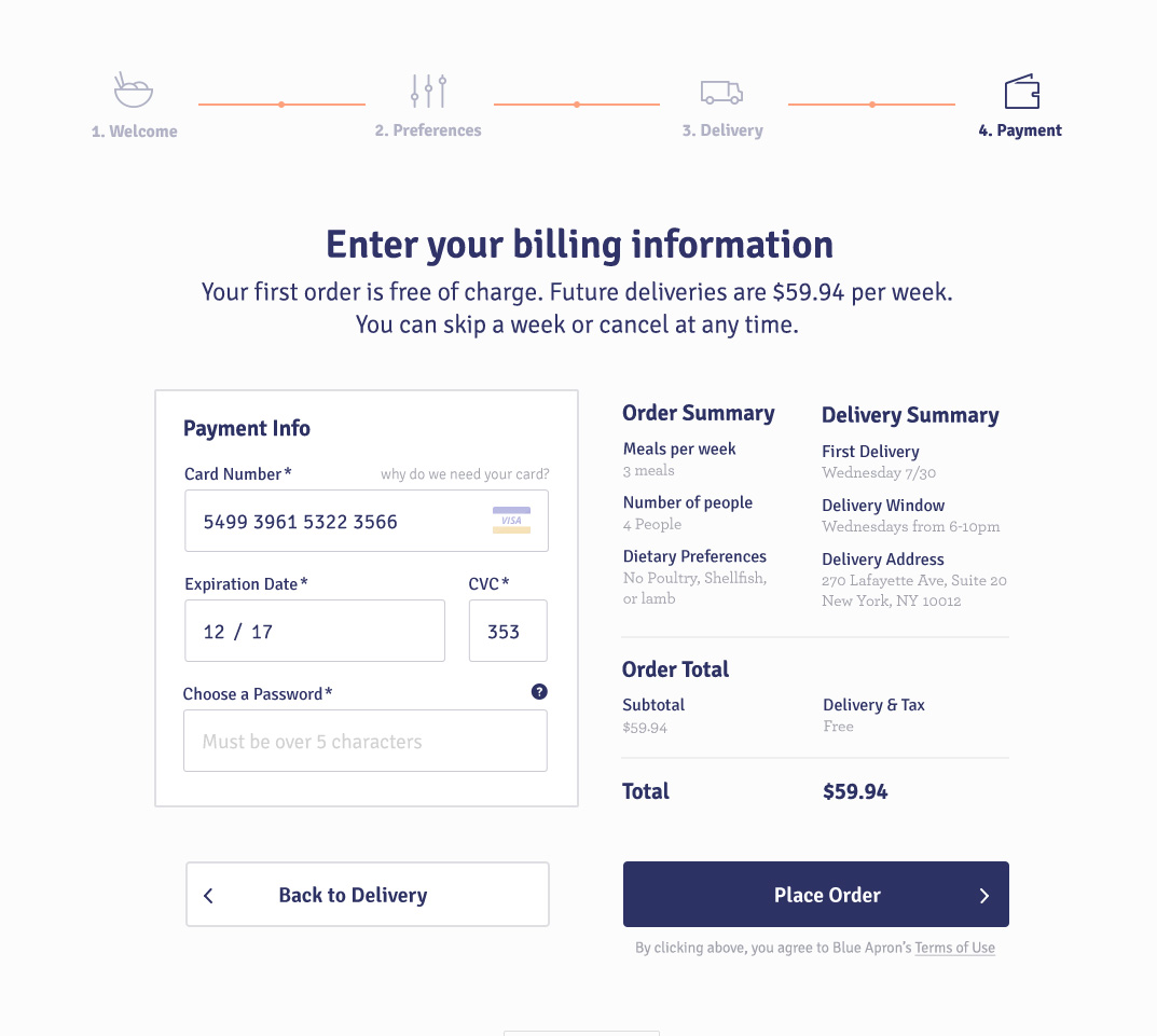
Step Four: Payment
As I mentioned, only 42% of users who made it to the final step of the previous flow successfully entered their card information and subscribed. Sure, a lot of this drop off could come from the compounding effect of the flow not providing enough needed information. Assuming so, a user would hope that this needed information would be provided before the last step. But when they arrive at the payment step and still have questions, they tend to leave.
 Payment step of sign up flow
In the new flow, we have done a significantly better job at presenting value and explaining details throughout each step. By the time they arrive at payment, the user should be in a much better position to submit their payment details.
One interesting change is that now you can create an account without entering payment information, and your preferences will be stored. This way, you can see the food management interface before committing financially. We suspected that this would vastly increase signup conversion, but the number we really care about is subscriber conversion, not ‘user’ conversion.
Users are asked to create passwords at this time (versus step one in the original flow) as they are at the final stage of commitment. In retrospect, I would have preferred to ask for password after signup and email activation to reduce complexity of this step.
To the right, a summary with full insight into the meal quantity, dietary profile, delivery, and cost breakdown is displayed. At this point in time, a user should have all the information they need to place an order and should genuinely trust the brand.
Oh hey, its mobile also
While the product has since undergone major updates on the mobile flow (native), I created a mobile version of the desktop signup flow. The initial ask was not a mobile-first experience, but rather a responsive desktop experience, with optimizations made for mobile users. The mobile experience is shown below:
Limited prototype of mobile flow. Reveal all Screens